Review: Samsung Vibrant
Jul 18, 2010, 12:31 PM by Eric M. Zeman
T-Mobile's version of the Samsung Galaxy S — the Vibrant — holds up well when pitted against the Captivate. It lags the Captivate in a few places, while besting it in others.
Form
Is It Your Type?

The Vibrant is one of the better Android devices available from T-Mobile. If you're looking for solid performance all around, you can't go wrong with Samsung's top-of-the-line Vibrant. There are a few things that prevent the Vibrant from being 100% awesome, though. Find out where it falls short.
Since the Samsung Captivate and Vibrant are so similar, many parts of this review are identical for both the Captivate and Vibrant. The Body, Three S's, and Wrap-Up are all unique, but most other segments of both reviews are the same.
Body
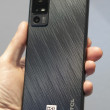
The Vibrant is a big slab of a phone. It's not as egregiously ginormous as the Droid X or EVO 4G, but it is big, just the same. It feels fairly light in the hand, but still solid and well made. Most surfaces are either plastic or glass, and it comes off a bit slippery in the hand. Not only that, but it looks almost identical to the iPhone 3G/3GS, which sadly takes away from its personality. The AT&T Captivate has a bit more of a unique appeal to the hardware.
The front is dominated by the large touch screen. There are four capacitive buttons placed at the bottom edge to access the standard Android Menu, Home, Back, Search actions. These capacitive buttons were not quite as responsive as I would have liked. They do, however, offer the option to include haptic feedback (micro vibrations) when touched. For those who need a little bit more guidance, the haptic feedback can be helpful.
The volume toggle is on the left side of the phone and I can't say I care for it all that much. It's small-ish, and has minimal travel and feedback. The power/lock key is located on the right side of the phone. It is way too small and difficult to find. Samsung likes to place the power/lock key in this spot on many of its phones. Given the size and shape of the Vibrant, it simply isn't all that comfortable to use.
The 3.5mm headset jack is located on the top of the phone, as is the microUSB port. The microUSB port is perhaps my favorite physical feature of the Vibrant. It is covered by a little door. The door slides sideways to reveal the port. It's much better to use than those sometimes-tricky hatches.
The microSD card slot is located under the battery cover, but thankfully not under the battery itself. The entire back surface of the Vibrant peels off easily to access both the battery and microSD card.
Slab-style phones are hard to make unique. The Captivate does a better job than the Vibrant. The Vibrant follows too many of the iPhone's cues, and comes across as too conservative and vanilla in my book.
The Three S's
Screen
What's not to love about Samsung's Super AMOLED display? It truly is beautiful. Colors jump off the screen. You want bright? Indoors the Vibrant is so bright that you shouldn't be surprised if it attracts flies and moths. Outdoors, it is readable, despite direct sunlight and finger grime. It's not perfect, mind you, but you can interact with the phone and see what you're doing on most screens.
Sound
The Vibrant sounds decent, but not amazing. During calls I placed, I noticed a slightly muffled and digitized sound to voices. Those with whom I spoke reported the same. As far as volume goes, the earpiece volume is good. It was loud enough that I could hear calls over a noisy air conditioner in the same room. Ringers and the speakerphone may be problematic. The speaker for both is placed on the back of the Vibrant. Most users will naturally place it on surfaces with the back down. When placed on a hard surface, such as a table or desk, you're not going to have any problems; you'll hear it just fine. If you place it on a soft surface, such as a bed or couch, however, the volume is diminished enough that you might miss calls if you're in another room.
Signal
The Vibrant did fairly well at capturing T-Mobile's signal, though it lagged the performance of some phones. In my tests around the metropolitan New York City area, it generally held onto two bars in areas where other phones held four or five. It waffled between one and two bars most of the time, and easily lost contact with T-Mobile's network altogether in some instances. Despite the iffy signal reporting, I didn't miss or drop any calls with the Vibrant during my tests. I did notice inconsistent data speeds, however. Sometimes it was really fast, other times it was really slow.
Battery
The Vibrant's battery life is really good, but doesn't quite match the Captivate. With the cellular radio, Wi-Fi, GPS, and Bluetooth on, I was able to make it through just under two days of use. That's far and away better than most other Android handsets on the market. We can thank Samsung's Super AMOLED display a bit, as it sips less power than LCD displays. The results here are noticeable. Color me impressed.
Touch
The Vibrant uses a capacitive touch display. I had zero problems with the performance of the main screen. It reacted every time I touched it. The capacitive touch buttons on the front were a bit inconsistent, however. I often had to press twice or thrice to spur them into action. Otherwise, it performed flawlessly.
Basics
Menus
The Vibrant, like all its Galaxy S brothers, runs TouchWiz 3.0 on top of Android 2.1. TouchWiz 3.0 is leagues better than 2.0 was, but I still find it pointless and somewhat annoying.
First problem? The home screen. There are seven of them, each customizable, but only to a degree. Along the bottom of all seven home screens are four permanent app icons. They are Phone, Email, Browser, Main Menu. These four icons can only be changed when the main menu itself is set to "customizable." It's awkward and difficult to find. Adjusting these apps should be much easier.
Beyond that, the main menu looks different when compared to other Android handsets. Rather than a long, vertical menu, it's split into pages. Each menu page holds 16 apps (plus the four permanent icons). There are three such menu pages when you start up the Vibrant out of the box. You swipe from side to side to access the different pages. The number of pages will grow as you add more apps.
The main menu can be viewed in an alphabetical grid (stock), a customizable grid, or in an alphabetical list. The list is pointless to use, if you ask me, because the icons are so huge and the number of applications so vast that you'll scroll forever to find what you want. The customizable grid at least allows you to put apps where you want to. The process is identical to the way apps are rearranged in Apple's iOS.
My last complaint is that the icons in the main menu are all placed on dippy-looking colored tiles that look exactly like iPhone apps. The effect is a rainbow-smattered menu that is just too happy and cheerful for my tastes.
Samsung has also added some action tools to the drop-down notification shade. When you pull the shade down, you'll see controls to turn Wi-Fi and Bluetooth on/off, and set the Vibrant to silent or vibrate. It's nice that Samsung buried them in the drop-down notification shade rather than take up screen real estate with them.
The rest of the menus for the settings and individual applications are exactly as on any other Android 2.1 device.
Speed is impressive all around. All applications open in an instant, and respond immediately to controls. The 1GHz "Hummingbird" processor that Samsung created for the Galaxy S line does a good job of giving the Vibrant the oomph it needs.
Calls/Contacts
Calls
The Samsung Vibrant's phone application appears to be the standard Android 2.1 phone application. From the home screen, press the phone icon and the dialer pops open. The Vibrant offers haptic feedback when you dial numbers, which is a nice touch. Users can choose to disable that if they wish.
From the call log, tap any call record and it will open up the list of recent calls to and from that number, along with links to send that person a text message or view the full contact details. If you press and hold a call record, a menu screen pops up with a list of options, which include calling the number, deleting the call log and so on. To the far right of the call log is a green phone symbol. Press that if you want to start a phone call right away.
Contacts
The Vibrant will import all of your Google and Exchange contacts if you have them. Adding Facebook friends is optional. If you choose to do that, the contacts application is smart enough to add the Facebook profile photos to your existing contacts and merge them into one contact. So, if you're friends with Bobby Smith on Facebook and he's also a Gmail contact, you'll see only one entry for Bobby, not two.
In the contacts app, press the profile picture and a little messaging menu pops up for that contact. If you have a phone number, it will show you the phone symbol to make a quick call, and you'll also have shortcuts to send your contact an SMS, write an email or go to the Facebook profile. If you know what you want to do when pressing a given contact, this makes the task just that much faster.
One interesting change here are some swiping actions that Samsung has added. When viewing your contacts in the main contact list, you can swipe to the right over the contact's name to automatically initiate a call to the default number in the contact's data. If you swipe to the left, it will automatically initiate a text message to that person's mobile number. Neat.
You can also choose to sort contacts via status updates and/or your most recent calling/texting history.
Messaging
The Vibrant supports most forms of messaging you expect to find on a device such as this. There is the native Android Gmail app, of course, and thankfully Samsung hasn't done anything to try to alter it.
There is also a separate email app for POP3/IMAP4. I couldn't get it to work at all. I tried a handful of POP3 accounts, and none of them were ever able to authenticate. I have followed up with Samsung about this issue and am still awaiting a response. This separate email program would also be used for an Exchange account.
SMS/MMS is supported in the "Messaging" application. This app works well. It offers threaded conversations, and if your SMS conversations are with a Facebook friend, you automatically see their profile picture next to each message. (Also true if you've set up a picture ID.)
The Vibrant also has limited instant messaging on board. Google Talk is a separate application and is the native Android app. Samsung hasn't changed it. If you want to use AIM, Windows Live, or Yahoo IM, you are going to have to take a stroll through the Android Market for third-party solutions.
Social Networking
All of the Galaxy S phones will include Samsung's new Social Hub software. The Social Hub software is similar to Motorola's Motoblur, or some of what HTC has done with Sense. In short, it collects all of the updates from your Facebook, Twitter, and MySpace accounts and streams them to one spot on the phone. The appears as a widget on one of the home screens. It can be set to retrieve messages automatically only as often as once per hour, but there's a manual refresh button on the widget, too.
The widget creates a vertical timeline that you scroll through up and down to see what your friends are up to. It displays profile pictures, so you get a nice visual representation of your timeline, and also lets you access links, TwitPics, and other content embedded in tweets or FB updates.
There is a reply and re-tweet function also built into the widget, so interacting and responding to friends is easy. Users can also update one, some, or all of their social networks at once from the Social Hub app.
It's not perfect — for example, you can't send a direct (private) message in Twitter — but it's easier to use than some of the other social streaming apps. It also looks fairly nice on the screen, and is easy to manipulate.
If you want to ignore the Social Hub, feel perfectly free to download the official (or third-party) Twitter, Facebook, and MySpace apps from the Android Market and use them separately.
Extras
Music
The Samsung Vibrant has the best music player I've encountered on an Android handset. The music player on the Vibrant is the first I can remember to offer a "CoverFlow"-like experience with album art, only it looks slightly different. When held sideways, the Vibrant automatically switches to the CoverFlow view. Instead of square CD covers, users see the album art imprinted onto round CDs. It's visually unique and different, so I like it.
The base music player menus are pretty much stock Android. Using tabs across the top, users can sort through songs, albums, playlists, and artists. The real changes are to the settings and options offered by the Vibrant.
The player itself has been refreshed a bit by Samsung. It's simply nicer to look at. The stock Android music player is drab and boring. This one has softer edges, and looks more modern.
Once you have some music playing, there are more options available in the settings. First and foremost, the Vibrant actually offers an equalizer. The equalizer has eight pre-sets and one eight-band, user-adjustable EQ. That's the sort of thing that really makes me happy.
Beyond the EQ, it also offers effects to adjust the sound, including: Wide, Concert Hall, Bass Enhancement, etc. Being able to apply both the EQ and effects really lets users shape the sound how they want. Sure, this may be more then the average user wants or needs, but for those who care about how their music sounds, it's good news indeed.
Other features include the ability to fine-tune how the music player menu system appears, and turn on/off a visualization effect during music playback.
Camera
Camera
Samsung has borrowed yet more software from its actual camera products and carried them over to the Galaxy S line. The camera can only be launched via a software key on the Vibrant's screen. Why there isn't a physical camera key is baffling. Samsung generally likes camera keys. Instead, users are stuck with on-screen controls only.
Once the camera is up and running, there are controls on the left and right side of the display to change the Vibrant's settings. A focusing square is in the center of the screen. The Vibrant lets users touch-to-focus, meaning if there's something in particular they want the Vibrant to focus on, simply touch it on the screen and that's where it will focus.
The controls are extensive, and offer features such as Smile Shot, Panorama, Continuous; scene controls (notably, it includes one for "Fireworks"); white balance control; ISO (sensitivity) settings; metering and even image stabilization.
The most interesting feature is that the Vibrant lets you fine tune the resolution it uses to capture photos. You have the standard 4:3 settings at 5, 3.2, 2, and 0.3 megapixels. You can also choose 16:9 widescreen settings, which are 4, 2.4, 1.5, and 0.4 megapixels.
The Vibrant takes about a second to focus before it captures images. The "shutter" button is placed at the bottom of the Vibrant's display.
Gallery
The gallery application is the Cooliris-made one that's found on the HTC Nexus One. It offers stacks of photos that are organized by time/date. You can quickly jump back to photos taken months ago, and have an idea of when they were shot. It's a better way to to sort through a huge photo library, if you ask me, when compared to a huge grid of photos. Opening each stack of photos will show a grid.
Oddly, the Gallery features are really limited. You can share via Gmail, MMS, Picasa, and AllShare, but that's about it. There are no editing features to speak of.
Pictures/Video
Pictures
The quality of the images I captured with the Samsung Vibrant was excellent. I was very pleased with all aspects. Focus was sharp, colors were true-to-life, white balance was right most of the time, and most images were free from grain and digital artifacts.
You'll easily want to share these images on Twitter, Facebook, and probably even Flickr. Are you going to print them out? Probably not, but you'll share them just the same.
Videos
Video looked fantastic. Sharp as heck. No artifacts. No real waviness or weirdness. Just clean, good-looking video. I did notice that sound was a little rough, though. The Vibrant's microphone might be a little too sensitive, as I heard some distortion from time to time.
Browse/Customize
Browser
The Samsung Vibrant relies on the stock Android browser for its main mobile web browsing tool. You can use your finger to navigate around web pages directly on the screen, and do things such as pinch-to-zoom or double-tap to zoom in and out.
As far as performance goes, I had a few data slowdowns in areas with poor coverage, but it performed well enough most of the time.
Customize
Here's one area where the Vibrant really falls flat. Most Android devices I've used allow users to customize the heck out of them. There's no customizing with TouchWiz 3.0. Sure, you can change the wallpapers (including live ones) , and the ringers, and the alerts and a number of deep-down settings. You can delete unused home screens. You can rearrange the order of apps in the main menu, and of course populate the seven home screens with widgets.
But you can't change the theme. You can't change the basic colors or appearance of the main menu icons. If you don't like the way TouchWiz 3.0 looks, there's nothing you can do about it.
Extras
Bluetooth
The Vibrant is one of the first phones to ship with Bluetooth 3.0. Bluetooth 3.0+HS is supposed to allow devices to pair and connected via Bluetooth, and then establish a Wi-Fi link between them for faster file sharing. It took some time, but eventually I got it working. Using just regular Bluetooth, I sent a 6MB MP3 file from the Captivate to the Vibrant. It took just over one minute. I then turned on the Wi-Fi for both devices and sent a different 6MB file. This time, the transfer took 5 seconds. I think I am going to like Bluetooth 3.0+HS very much.
It also supports regular pairing with mono and stereo Bluetooth headsets. This feature functions perfectly well. Call quality was good through mono headsets and stereo music playback was OK, but not stellar. I was able to pair it with several PCs, and pass image files back and forth without too much trouble.
Clock
As with many Android phones, the time is displayed in a large digital read-out when the screen is woken up. Pressing any button wakes the screen, and you can easily read the time from an arm's length away. The clock application also offers an alarm, world clock, stopwatch and timer.
Navigation
The Vibrant comes with both Google Maps and T-Mobile's TeleNav software. Google Maps is free, and at this point is a known entity. It offers simple-to-use features, free turn-by-turn navigation, and generally works well. The TeleNav software commands a monthly fee, and does the same things. Since to me there's no major advantage to TeleNav, you may as well stick with the free Google Maps. If you find it isn't enough, you can always try T-Mobile's software.
MediaHub
The Galaxy S line of phones will all come with Samsung's MediaHub software on board. This piece of software is a place for users to buy and download content, such as music and movies. The service isn't up and running yet, so I couldn't test it. Samsung couldn't say if/when it would go live for U.S. customers.
Swype
Out of the box, the Vibrant runs Swype's predictive text entry software. After many trials and tribulations, I've decided it's just not for me. Thankfully, you can go with either the stock Android keyboard or the Samsung keyboard. Both are decent alternatives. Swype, though, might work well for many users.
Video
The Vibrant comes with MobiTV on board. MobiTV requires a subscription. In the trial that I ran, quality was better than T-Mobile Mobile Video, but it was still garbage. The Vibrant is also packaged with an optimized version of Avatar. Avatar looks stunning on the AMOLED display. High-def movies that I loaded myself looked equally good. The AMOLED display makes the Vibrant a killer video playback machine.
Video
Wrap-Up
The Vibrant is one of the better Android handsets available from T-Mobile. It beats the CLIQ and CLIQ XT hands down on many levels. It easily offers one of the best displays available in T-Mobile's entire offering. Some may not like the large size of the device (a result of the large display), and those people could be happy with the smaller myTouch 3G Slide. It also doesn't have a physical keyboard, so those who require one might also have to stick with the myTouch 3G Slide.
The media performance of the Vibrant is above par for Android devices. Additions to the music player software are welcome and appreciated. The camera software is more advanced, and happens to take great pictures, too. Even video captured with the Vibrant is good.
Browsing is decent, calls are decent, battery life is outstanding. Those are all things to like.
My complaints are mostly with the menu system, and the locked-down version of Android that comes with the Vibrant. It simply isn't as flexible and customizable as many of the competing Android handsets (and I personally don't like the way it looks.) However, many people may have no problem with it.
If you've been cold on T-Mobile's Android lineup to-date, the Vibrant is something to get red hot about. Well, maybe a nice warm orange. Either way, it's a solid addition to T-Mobile's Android lineup.
Comments
The 4 icons at the bottom ARE changeable!!
That sounds like a little much.
AllShare and HDMI out
(continues)
Night Mode
Umm, what exactly is locked down?
Vibrant is fantastic
Just choose "customizable grid", then click "menu" and "edit", then you'll be able to change the two middle icons.
For me (coming from a G1, and testing out every other phone on the market, other than the Droid X), this phone is incredible, and honestly, I can't think of another better phone on the market. Is it perfect? No, but it's got so many things going for it (incredible screen, fast processor, and great UI enhancements, fantastic photos and video, and more).
I wish it had some sort of dpad, or at least had arrows for text selectio...
(continues)
(continues)
I'm going to check it out
skywalkershawty said:
FIRST! lol I've never done that b4 so I figured I'd be an a**
Congrats.
just a couple things from the review I dont agree with
(continues)


 Hands-On with Samsung's Galaxy S Phones for the US
 Samsung Refreshes Galaxy S Series with S Pen, New Cameras
 Samsung Refines its Foldable Phones
 Samsung Upgrades its Wearables
 Samsung S24 Series Adds More AI, Updates the Hardware
 Samsung Vibrant (Galaxy S)

