Review: Samsung Intercept
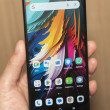
The interface on the Samsung Intercept is about 90% basic Android, 10% Samsung. Samsung has mostly added some color to the menu screens, but only a splash. The troubling white text on black background remains for all settings menus. The homescreen is pure Android; no hint of Samsung's TouchWIZ interface here. But it only offers three panels, instead of the standard five that is usually the minimum on Android 2.1 phones. The screen may be small, in terms of both inches and pixels, but it still offers the same number of slots for shortcuts and widgets as other Android phones. Icons are just smaller, slightly lower res and less vibrant looking on the Intercept's WQVGA screen.
Samsung has also added its own colorful touch to the dialing screens, the contact list and calendar apps, and the whole interface gets some slight blue highlights. Too bad Samsung left some of the more problematic apps untouched, like the music player and the camera app. Samsung has done a fine job with both these features on other phones and dedicated devices in the past.
Even with its reduced resolution screen, the Samsung Intercept could run most of the Android apps I loaded, though not all of them. Live Wallpapers are out. Most apps worked fine, including Google Goggles, Sky Map and all the Google first party apps. Facebook and Twitter looked the same as on other Android phones. Layar ran a bit slowly, especially browsing the various layer options, but the augmented reality mode looked smooth. The phone could not run Speed Forge 3D, one of the more graphically intense Android games. The game crashed every time.
Samsung did not change the software keyboard on the Intercept; it's the basic Android version. It was absolutely tiny on this phone's display. Too bad the phone doesn't get Swype's software keyboard. I tried to download the beta version, but it currently doesn't support the WQVGA resolution.


 iPhone 14 Plus Offers a Big Screen For Less
 Major Update to Google Messages Brings iPhone-Compatible Emoji Reactions
 Apple Watch Goes Ultra
 Snapdragon 8 Gen 3 Can Run Generative AI Voice Assistant On-Device
 New Case Adds Keyboard to iPhone Pro
 Samsung Intercept


