Review: Motorola Charm
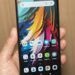
Almost all of the problems I had with the Motorola Charm could have been solved with a much better screen. The interface would have been more pleasant to use, though I still enjoyed the custom Motorola widgets and the useful, if occasionally repetitive, social networking features. Web browsing would have been instantly more enjoyable if text were easier to read and pictures looked sharper than they do on the Charm's low resolution display. Photos might not improve, but at least I wouldn't be embarrassed to show off my pictures if the display didn't look so dated and blocky.
Even with the low res screen, I can still recommend the Motorola Charm. The keyboard is wonderful. Even for its small size, it made typing a delight. The phone may be small and less powerful, but Motorola hasn't skimped on software features, and the phone gets the full Android 2.1 treatment, with Live Wallpapers, Exchange support and free navigation in Google Maps, in addition to the full complement of MotoBLUR interface enhancements. The form factor is also unique for Android, and as more and more curious BlackBerry owners take a look in Google's direction, the Charm might be a foot in RIM's door.
But my warning to buyers is that they should do some heavy reading on the phone's screen before they commit to a two year contract. Some folks might not mind, so if you've spent some time with the phone and the screen isn't a bother, the interface and extra features only grow more rewarding over time.


 iPhone 14 Plus Offers a Big Screen For Less
 HMD Launches Barbie Phone in US
 iOS 16 Revamps the Lock Screen
 Apple Watch Goes Ultra
 Google Overhauls Android's Parental Controls
 Motorola Charm


