Motorola & Nokia Summer Kickoff
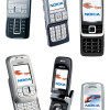
Back at JavaOne, Nokia was showing off the new slider lines they announced two weeks ago. Two versions of the 6111 were at the show, one with a white bezel, and one with a black bezel. The models were otherwise identical. The 6111 looks and feels very small - it will slide into pockets with ease. Despite its diminutive size, the 6111 was very easy to use - the slide, the control keys and even the keypad. Although the 6111 still uses Series 40 version 2, it at least has a 128 x 160 display like the 6255i.
6280 and 6270
Despite the fact that it's a 3G phone, and 3G phones have a reputation for being rather large, Nokia's 6280 is the smallest of the three new 62XX sliders. We were immediately taken with the large, bright screen. It's hard to miss on this slider. The screen's excellent color depth also helps to create a solid first impression. The 6280 has a smooth round form factor that looks unified and polished; it obviously is meant to be the flagship, as well as the basis for the other two sliders. All the edges are nicely rounded and there is no wasted space.
Especially when compared to the 6280, the 6270 just looks cheaper. First, it's visibly larger than the 6280. The bottom, instead of being rounded off in a convex fashion, is concave and protrudes out from the shape, ending with the bottom edge of the keyboard peeking out from beneath the face. This destroy the smooth lines of the 6280. The 6270 also just looks cheaper - maybe it's the matte plastic bezel, maybe it's something else, but it doesn't feel like a top-of-the-line GSM phone.
We were surprised to learn that the 62XX series (or 6111 for that matter) does not have a lens cover for the new 2 Megapixel camera, considering the recent 6680-series smartphones all have sliding lens covers. However since that would only increase the thickness of the phones, which are already thick since they are sliders, it makes sense. We just worry about the lens. The camera software works in landscape format, much like the camera on newer Sony Ericssons, and we were impressed by the interface as well as the quality of the pictures.
Finally, you can see a white screen with some text and icons on the first picture above. That is Nokia's new standby screen for Series 40 version 3. It is not complete yet, which is why it is white. When finished, it will be similar to the home screen on Microsoft Smartphones and Nokia's very newest Series 60 phones, featuring shortcuts to recently used applications as well as line displays for time and date, phone status, new messages and upcoming appointments. The white will be transparent, overlaying the data on the wallpaper, just as on Smartphones.


 Nokia Nseries Launch
 Nokia Raises Series 40 To New Heights
 Samsung Refreshes Galaxy S Series with S Pen, New Cameras
 iPhone 15 Series Goes All-In on USB-C and Dynamic Island
 Nokia N90
 Nokia 6270
 Nokia 6265i

