Review: Samsung Infuse 4G
From here on out, the Infuse mirrors other Samsung devices almost exactly with respect to the software experience. It runs the same version of TouchWiz on top of Android 2.2.1 that the recently-reviewed Droid Charge does.
I continue to dislike the color schemes chosen by Samsung for its TouchWiz user interface, but that's a personal preference. The Infuse has seven home screens, most of which can be adjusted at will to suit individual tastes.
The main app menu is laid out in 4 x 4 grids that slide from side to side - like the iPhone - rather than up and down. Applications are listed alphabetically by default, but it is easy to rearrange them into any order you like. The main menu can also be set to appear in a single list view.
Otherwise, the overall menu architecture is about what you might be used to with Android.


 Samsung Refreshes Galaxy S Series with S Pen, New Cameras
 Samsung Upgrades its Wearables
 Samsung S24 Series Adds More AI, Updates the Hardware
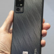
 Samsung Infuse 4G


