Review: HTC Status
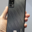
The HTC Status is an attractive phone, though not without a few faults. Taking a cue from the BlackBerry, it mates a portrait-style QWERTY keyboard with a smaller touch screen in an appealing form. It's smaller than HTC's largest smartphones, and is comfortable to hold and use. The materials are standard HTC fare, though the fit and finish isn't quite up to par with some of HTC's top-of-the-line devices. There are some odd gaps in the seams here and there, and some of the panels feel a bit creaky. The metallic and plastic surfaces feel good in the hand. It's certainly pocket-friendly, though because of its slight banana shape, you're going to want to be sure to put it in your pocket with the screen/keyboard facing your leg.
The Status's display is a bit small. For anyone use to the full-sized screens of HTC's other Android devices, the Status will surely disappoint in this respect. There are the standard four Android control keys below it, all of which are capacitive. They worked well, though they were not always quick to light up. This means in the dark, it was sometimes hard to find the right one.
There are also two physical send/end keys below the capacitive controls. I haven't seen dedicated send/end keys on an Android phone in what feels like ages. I forgot how nice it is to be able to end a call by quickly pressing the end button. Both buttons work well.
The QWERTY keyboard is one of the best I've seen from HTC in a long time. I prefer the portrait-style keyboard to the sideways-slider style keyboard, and I found the Status's very appealing. The buttons are well-spaced, have a good shape to them, and offer excellent travel and feedback. The keyboard has four rows and offers some neat shortcuts. It has dedicated buttons for the period and comma, but requires use of the alt key to enter ".com" or "@". HTC wisely included four directionals (left, right, up, down) to help with editing text on the screen. Android's typical text editing tools will be hard to use given the small amount of real estate. Last, a long press of the spacebar opens up the settings menu. Also, a long press of the comma key opens the camera (and then serves as a physical shutter button). These are thoughtful touches.
Below the keyboard, all by itself at the very bottom of the Status's front face, is the Facebook button. Given how important it is to this device, I think it should be bigger, and have better travel and feedback.
My biggest gripe in the Status's design has to do with what I feel is wasted space on the front. The capacitive control keys, the send/end keys, and the Facebook button all take up a lot of vertical space on the front of the phone. I would much rather HTC had reduced the space around these keys and given the Status a slightly bigger display.
In standard HTC form, the volume toggle is a teensy sliver of plastic on the left side of the phone. It has acceptable travel and feedback. The microUSB port is below it. There are no controls on the right or bottom edges. The top houses the power/lock key and the 3.5mm headset jack is next to it. The power/lock key is just right: it is easy to find, and has good travel and feedback.
In what has become an annoying characteristic of HTC smartphones, the battery compartment is not easily spotted at first. Once you figure out where it is, getting the battery cover removed is a pain in the butt. Doubly annoying, the battery has to be pulled if you want to swap out the microSD card. C'mon, HTC, you know better than that.


 AT&T Updates Its Facebook Status to Intro HTC Status
 iPhone 14 Plus Offers a Big Screen For Less
 Qualcomm Taps Iridium for Satellite Connectivity
 New Pixel Feature Drop Adds Two-Way Voice Calls via Text
 HTC Status


