Hands-On: Samsung Galaxy S II and Epic 4G Touch
Aug 30, 2011, 7:20 PM by Eric M. Zeman
updated Aug 31, 2011, 11:55 AM

Samsung revealed its Galaxy S II variants for the U.S. market with AT&T, Sprint, and T-Mobile. Phone Scoop goes hands-on with the latest flagship device from Samsung.
Intro
Samsung is bringing the Galaxy S II to the U.S. in three different flavors. Though the handset was first announced at Mobile World Congress in February, the U.S. variants all feature some notable differences when compared to the global version.
Putting all three through their paces, each of the variants has an identical version of TouchWiz on top of Android 2.3 Gingerbread. The displays were insanely impressive, as was the speed of the user interface and responsiveness of the devices.
Here is Phone Scoop's hands-on impression of each of the new handsets for AT&T, Sprint, and T-Mobile.
AT&T
Samsung re-announced the Galaxy S II with a lot of hullaballoo today in New York City, despite the fact that the device was actually announced in Barcelona seven months ago.
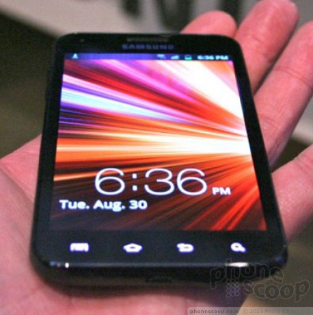
The S II for AT&T is amazingly thin. It is about as thin as they come. Samsung used a special, new Super AMOLED Plus display that itself is thinner than previous displays. It is also light as a feather. I can't recall a device that weighed as little as the S II. It'll slip into the tightest pocket.
As far as feel in the hand is concerned, its it doesn't feel all that different than some of the other Galaxy handsets out there, such as the Infuse 4G on AT&T's network. Because of the huge display, it is an enormous phone and very wide. It's near impossible to get your hand all the way around it. The back has a textured surface that reminds me of carbon fiber. The one bummer is that the S II still has that plastic-y feel of its Galaxy S predecessors. I would prefer it to feel more solid and seem some metal in the design somewhere rather than all the plastic that is used in the housing. For whatever reason, Samsung seems to be averse to using metal in its handset designs.
The Super AMOLED Plus display is ridiculous. It simply looks fantastic. Even in blinding white light, the display dazzled with its colors, brightness and clarity. Samsung really knows how to make fantastic displays on its devices. Oddly, the AT&T version of the S II has a 4.3-inch display, whereas the other two versions shown off tonight have 4.52-inch displays. AT&T wasn't able to explain the difference.
The rest of the S II takes a minimalistic approach. Thankfully, Samsung whittled the bezel down to almost nothing and the display fills most of the face of the phone. The power/lock key is on the right, the volume toggle is on the left, and there are the usual four buttons below the display.
The user interface builds on Samsung's TouchWiz software, but also tones TouchWiz down a bit. The main menu looks and acts just like other Galaxy TouchWiz phones, but the home screens are slightly different. Samsung has created its own widgets to collect information on the home screen. They can be used to stick all sorts of content from the web there, including RSS feeds, weather, news, email, social networks, and so on. The design of these widgets is clean and crisp, though it is easy to clutter up the home screen if you stuff too many on there.
The newest version of TouchWiz gets rid of all the dippy-looking, chicklet-sized icons that I've disliked intensely of previous versions of TouchWiz. Instead, Samsung has allowed the UI to look like a more natural version of Android. While there's still a decidedly Samsung feel to the user interface, it is far, far less obnoxious than it is on other Galaxy devices.
Perhaps most interesting, the new TouchWiz adds the ability to adjust all the home screens at the same time. Pressing and holding the home screen brings up a new dashboard that lets users customize each of the home screens from one spot rather than adjusting each one-by-one.
The user interface was lightning fast. I was able to jump from app to app, from screen to screen, in a jiffy. With a dual-core 1GHz processor under the hood, it has plenty of power to get things done.
Aside from the slightly plastic feel to the Samsung Galaxy S II, it's a truly impressive phone. Well done, Samsung.
Sprint: Epic 4G Touch
The Sprint version of the Galaxy S II has been named the Epic 4G Touch. It is nearly identical to its Galaxy S II brothers, but has the benefit of including WiMax 4G, as well.
The Epic 4G Touch for Sprint is amazingly thin. What's crazy is that the Epic 4G Touch also packs WiMax. This is by far the thinnest WiMax phone to date.
As far as feel in the hand is concerned, it it doesn't feel all that different from the other Galaxy S IIs. Because of the huge display (4.52 inches!), it is an enormous phone and very wide. It's near impossible to get your hand all the way around it. The back has a textured surface that reminds me of carbon fiber. The one bummer is that the Epic 4G Touch still has that plastic-y feel of its Galaxy S predecessors. I would prefer it to feel more solid and seem some metal in the design somewhere rather than all the plastic that is used in the housing. For whatever reason, Samsung seems to be averse to using metal in its handset designs.
The Super AMOLED Plus display is just as awesome on the Epic 4G Touch as it is on the S II for AT&T.
The rest of the Epic 4G Touch takes a minimalistic approach. The power/lock key is on the right, the volume toggle is on the left, and there are the usual four buttons below the display.
The newest version of TouchWiz gets rid of all the dippy-looking, chicklet-sized icons that I've disliked intensely of previous versions of TouchWiz. Instead, Samsung has allowed the UI to look like a more natural version of Android. While there's still a decidedly Samsung feel to the user interface, it is far, far less obnoxious than it is on other Galaxy devices.
The user interface was lightning fast. I was able to jump from app to app, from screen to screen, in a jiffy. With a dual-core 1.2GHz processor under the hood, it has plenty of power to get things done.
Aside from the slightly plastic feel to the Samsung Galaxy S II Epic 4G Touch, it's a truly impressive phone. Well done, Samsung.
T-Mobile
The T-Mobile version of the Galaxy S II differs from the AT&T version in shape and screen size. The corners are more rounded, and the display measures 4.52 inches.
Disappointingly, the T-Mobile variant of the Galaxy S II was under glass this evening. We weren't able to go "hands-on" per se, but we got a close-up look at it.
From what we can tell, it is almost 100% identical to the ATT version of the S II. Same basic feature set, same buttons, same overall feel and performance.
For whatever reason, T-Mobile wasn't ready to show off the hardware and software tonight. Several Samsung staffers intimated that the reason the T-Mobile variant wasn't available to touch was because it runs a different processor (Nvidia Tegra2) than the others, but this is unconfirmed.
Comments
Mango Version??
QWERTY?
Unless there is an EPIC II coming out this is a fail on their marketing part.
Physical keyboard?
And I would really like to see a higher resolution display. Especially for a screen as big as the Sprint's Epic.
And speaking of the Sprint's Epic - they dropped the physical keyboard?
I would suggest Samsung to offer the same phones, with higher resolutions, and physical, 5-line keyboards. Some of us just like real keyboards too much and aren't ready to give it up.


 Review: Samsung Galaxy S II for AT&T
 Motorola Upgrades its razr Foldables Across the Board


