Review: Pantech Breakout for Verizon Wireless
It isn't very easy for hardware makers to differentiate their Android phones these days. There's only so much you can do with the slab-style form factor, and I find most designs wind up uninspiring and somewhat boring. The Pantech Breakout at least attempts to be a little different.
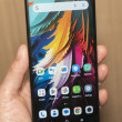
The Pantech Breakout is about the same size and shape as most other Android slabs, but the back surface is covered in a patterned, matte black finish that feels like the handle of a handgun. The matte black really works for me, especially because it doesn't collect finger oils or other grime. It also gives the Pantech Breakout a feeling of legitimacy and strength. The side edges of the Pantech Breakout are smooth, and the front surface is glossy and glassy. It fits well in the hand, and will easily fit into a pocket.
Slab-style Android devices don't have many options when it comes to designing the front controls: It's either capacitive or physical buttons. Pantech opted for the latter on the Breakout. Rather than give them a boring design, however, Pantech gave them a nice masculine look with a mix of silver and black accents. The Home and Back buttons are placed together in a silver semi-circle that is raised nicely from the surface of the front. All four buttons feel great under the thumb and offer excellent travel and feedback.
The volume toggle is on the left side of the Breakout, near the top. Both the up and down halves have a perfectly shaped nub to let you know which is which, and the buttons feel great. There is a voice command key below it, closer to the bottom of the edge. It also has a good shape, and feels good to use.
On the right side, there's a hatch that protects the microUSB port. It's a big hatch, but functions without issue. The power/lock button is placed right in the middle of the right side. This is an odd spot for this button. I'd prefer it to be closer to the top of the phone, if not actually on the top itself. In fact, I often found myself pressing it accidentally believing it to be the camera button. It's a little bit on the small side, but has a nice shape to it and it works well. Ditto for the dedicated camera button, which is in the usual camera button spot near the bottom of the right edge.
The 3.5mm headset jack, which allows you to use your favorite stereo headphones, is on the left side of the phone. I'd prefer it to be on top, but you may not care about that.
The battery cover slides off with a bit of firm pressure. Neither the SIM nor microSD card can be removed without first removing the battery. This is annoying (at least as far as the microSD card is concerned), but I suppose it isn't the end of the world.
In sum, the hardware mostly rocks. The Breakout has to be the best hardware I've ever seen from Pantech. It's solid, functions well, looks good, and feels good to use.


 Pantech Breakout Boasts LTE for Verizon Wireless
 Samsung Upgrades its Wearables
 Samsung Brings Backs Watch Classic with Rotating Bezel
 Motorola Shows Off New Concepts in AI, Foldables
 Pantech Breakout


