Hands-On: Pantech Pocket for AT&T
Oct 12, 2011, 5:28 PM by Eric M. Zeman
updated Oct 12, 2011, 5:29 PM

One of the more interesting devices announced during the CTIA trade show this week is the Pantech Pocket. This Android smartphones offers a wide(r) screen than most other Android devices and is a fine phone from Pantech. Here are our initial impressions.
The Pantech Pocket is a truly interesting device. Rather than run with a 16:9 aspect ratio screen that most Android phones have settled on, Pantech decided to do something different. The Pocket has a 4:3 aspect ratio, which is the same as your old analog TV. Aside from giving the Pocket a somewhat goofy appearance (it's hella wide) the extra real estate gives the Pocket a surprising advantage over the competition.
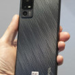
The Pocket eschews the modern Android smartphone design norm, which has drifted into boring, shiny, monoblock devices that have no personality. The Pocket has personality to spare. It is extra wide, but still very thin and light. The back and sides are covered in a textured plastic that has an excellent feel to it while also lending some much-needed grip. I really liked the texture and the overall feel. It is put together well.
The basic Android system is mostly stock, and it is controlled with the help of four capacitive touch buttons that are placed below the display. Other controls are kept to a minimum. THe volume toggle is on the left edge, and the microUSB port is on the right. The power/lock key is a round dot on the top of the Pantech Pocket. It feels great and is easy to find.
More so than the shell, the display and software are what really defines the Pocket.
First, the lock screen has been customized. There's a large ring in the center of the lock screen and it is surrounded by six apps. Drag the app you want into the circle and you go directly there. Out of the box, those apps are the phone, SMS/MMS, email, browser, main menu, and the media player. Yes, Pantech forgot to include one for the camera, d'oh! Lock screen shortcuts like these are a great addition to recent Android devices, and the Pocket's is a good implementation.
Most of the user interface and menu are unaltered Android 2.3 Gingerbread. The apps and services all fit the odd aspect ratio of the Pocket with no problem and looked fine.
The killer feature of this wider-screened device? The software QWERTY keyboard. The extra width of the display gives the software QWERTY the perfect extra amount of breathing room. Typing on it was much, much better than what you'd get on any other Android device. Rich and I were both able to type quickly and with few errors using the device. What this boils down to is that the Pocket will make a great messaging device.
Other notable software enhancements include the ability to scribble on pictures after they are taken and processed in the background. You can then send the marked-up image off as an MMS.
Pricing and availability have not been set for this phone. It isn't the highest-spec'd Android device ever, and Pantech representatives said the price point will be as aggressive as possible. Look for the Pantech Pocket to land in stores in early November.
Comments
Why


 Review: Pantech Pocket for AT&T
 AT&T Announces Five New Android Smartphones
 Pantech Pocket


