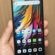
Hands On with the Huawei Mercury
Jan 10, 2012, 4:59 PM by Rich Brome @richbrome

The Mercury is out with Cricket, but CES has been our first chance to try one. It's and unusually high-spec Android phone for both Huawei and Cricket. How does it stack up? Read on to find out.
Article
The Mercury isn't the low-end phone you may have come to expect from Huawei in the US. The 4-inch display looks quite nice, the camera is 8-megapixel, and it even looks a bit high-end in the style department.
Although the design looks nice and feels well put-together, it's extremely glossy, attracting fingerprints like mad. It feels plastic and lightweight, but at the same time feels solidly built. On the size scale, it's small and pocket-friendly.
The buttons are all great; if only they could have added a camera button.
The processor is fast enough to make it feel speedy.
The Android flavor is Gingerbread. It's stock in some areas, like the ugly camera interface. But Huawei has customized the main app menu. The main tweak is that you can drag app icons to arrange them any which way you like. That's a welcome feature, although the way they've implemented it is much like iOS - wiggling icons and all - that I can't help wondering if Apple's lawyers have seen it yet.
All in all, our first impression is that this is a promising little Android phone with some nice specs and features. It's on sale now for $230 with no contract.
Comments
No messages


 Huawei Mercury Touches Down in Cricket's Lineup
 Huawei Mercury


