Review: LG Spectrum for Verizon Wireless
The Spectrum runs Android 2.3.5 Gingerbread with some light tweaks to the appearance of the icons and menus thanks to LG. It will be updated to Android 4.0 at some point later this year, but neither Verizon nor LG has indicated when.
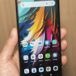
It offers seven home screens for personalization, and the dock at the bottom of the screen has four items in it (phone, messaging, browser, apps). You can switch these out for something else if you want to, but it's a headache to do so.
LG has its own tool for customizing the home screen with widgets and shortcuts, etc. It slides up from the bottom of the screen and give you a small selection of widgets in grid form to choose from. You can easily sort between widgets, apps, shortcuts, and folders using this tool thanks to some buttons at the bottom.
The main app menu is a disaster. There are only two possible views: a vertical list, or an LG-organized grid/folder system. The vertical list is organized alphabetically and is interrupted by HUGE bars that let you know you've reached apps that start with the letter F or the letter U. Wasted space. The LG-designed grid offers apps grouped by category. The categories are arbitrary ones chosen by LG/Verizon, such as Communications, HD, Media, and Verizon Wireless. The categories can be added, deleted, and moved around however you see fit. You can also transport apps between categories if you wish. It's not exactly user friendly, though and takes a lot of time to customize properly.
The notification shade hasn't been customized in any truly unique way, but it does provide controls to toggle on/off the cellular, Wi-Fi, Bluetooth, and GPS radios, as well as the sound.
The Spectrum makes huge performance improvements over other LG smartphones we've recently reviewed. Though it has much of the same software on board, it is speedy throughout the user interface. I didn't notice any problems such as slow apps or stuttering screens. It feels smooth and natural, and doesn't make me want to pull my hair out.


 Hands On with the LG Spectrum for Verizon
 LG Announces Spectrum for Verizon
 LG Spectrum


