Review: Motorola Droid RAZR MAXX for Verizon Wireless
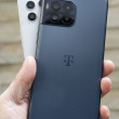
The Droid RAZR was a good looking phone. It's heftier brother, the RAZR MAXX, is also a good looking phone, there's just more of it to love. Where the RAZR was a ludicrous 7.1mm thick, the RAZR MAXX is a more average 8.9mm thick. It's hardly what anyone could call chubby, and that extra thickness and weight manages to make the RAZR MAXX feel sturdier than the original RAZR. It carries forward everything I liked about the RAZR in an overall more complete package.
In order to get the MAXX so thin, Motorola employed the pancake method (aka, smooshed it), pushing the width and length out to attain the thin profile of the MAXX. It's a huge phone for being so thin. Where the RAZR was akin to Larry Bird, I'd say the RAZR MAXX is more like Shaquille O'Neal. Less lanky, more muscular.
In the hand, it feels wide. I have big hands, and I can't wrap them all the way around the RAZR MAXX. The quality of the materials and build, however, feel great — the best I can recall from a Motorola in recent months. The glass surface feels wonderful under the thumbs and all the seams are fit snugly together. The back surface is composed of Kevlar and feels awesome to the touch. As with the RAZR, the back cover of the RAZR MAXX really attracts finger grease and oils.
The front of the RAZR MAXX is mostly display, and Motorola put the typical four Android controls under the screen in the form of capacitive buttons. The amount of haptic feedback given them by Motorola is just as good as on the RAZR; they feel great to use. Though regular physical buttons would be easier to find in the dark, the back-lit keys are easy to see.
The SIM card slot and microSD card slot are located on the left side of the RAZR MAXX. They are protected by an annoyingly difficult-to-remove hatch. You have to *really* want to get at either card to spend the time and energy prying it open.
The lock button is easy to find, and feels good thanks to its textured surface. It also doesn't hurt that it's silver while the rest of the phone is black. I can't say the same for the volume toggle. It's black and nearly invisible. Worse, it's too small and the action and feedback is absolutely terrible. The size is the biggest problem. It's about 1.5cm, which means you can accidentally turn it up when you mean to turn it down and vice versa.
Motorola opted to put the micro-USB port, mini-HDMI port, and 3.5mm headset jack on the top of the phone. I can't stand when handset makers put the charging ports on the top. It makes using the phone when it is plugged in much more awkward than it needs to be. In this case, the MAXX's ports are configured so that they will work with Motorola's lapdock accessories. (I still wish they were on the side.)
As with the RAZR, the battery is sealed into the RAZR MAXX, which means no replacing it. The good news is, however, that with 3300mAh of power encapsulated in there, you'll have no need of a spare power supply.


 Hands On with the Moto Droid 4 and Droid RAZR MAXX
 Review: Motorola Droid RAZR for Verizon Wireless
 Hands On with the Motorola Droid RAZR and ACTV
 Motorola and Verizon Announce the 7.1mm Thick Droid RAZR
 Blue Moto Droid RAZR Hitting Stores Starting Today
 Motorola Droid RAZR
 Motorola Droid RAZR MAXX


