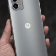
RAZR Replacement Sneaks Out Of Chicago
I'd like to see at WCDMA/GSM, personally, a requirement for my next phone (so I'll be waiting a little while.)
I guess Moto ...
(continues)
not one, but TWO new pieces of $h!t...
http://www.gizmodo.com/gadgets/cellphones/cellphone- ... »
http://www.slashphone.com/83/4561.html »
(Note: at the bottom of both articles...click "bengalboy" for even more pics.)
come on motorola...with all that money ur making...can't u spend it on a better, more intinuative design team? ever heard of getting new ideas? stop stretching this design as far as it will take you (to the bank in this case).
...
(continues)
(continues)
It is like the Apple model. Each generation of HDD iPOD's aren't revolutionary new models, they are improvements with added features (photo, video, larger capacity).
Mo...
(continues)
Its got Cingy's Name all over it!
Ah, I can't wait
It's quite nice in your hand...
It's a bit longer, but the reduction in width makes it fit in the hand better. The style is pretty sweet, with the more stylish keypad. The screen, though smaller, looks more lifelike and brilliant than the original RAZRs.
The one I held was loaded with MEdia Net and Cingular logos, if that tells you anything.
The test unit I held was speedy and seemed to have no software malfunctions that I could see (which isn't too common in an engineering sample). One interesting note is that they've borrowed the "back" button from Sony Ericsson. On the right side just below the sc...
(continues)
Motorola
Difference?
Same old UI?
The least they could do is design new icons and go to a 3x4 or 4x4 layout. Is this to much to ask?
Looks like PLASTIC!!!!
i kinda like it


