Review: HTC One X for AT&T
(For all intents and purposes, the AT&T One X and international One X are identical, save for some changes to the innards. Therefore, much of this review is carried over from the previously-published review of the international variant of the One X)
With the One X, HTC managed to change everything and nothing at the same time. It's clearly within the HTC design gene pool, but looks more like what would happen if a mad scientist spliced all the favorable characteristics of the HTC DNA into one, ideal strain. The results aren't perfect.
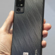
The defining design trait of the One X is HTC's use of polycarbonate to mold the back casing of the phone. Not all One Xs will be created equal, depending on your preferences. The black version we tested has a soft-touch finish, but the white version will have a glossy texture. The material and its inherent qualities will be the same, however. This high-tech piece of plastic is a contiguous shell that fully envelops the sides, edges, and back of the device. There are no seams, which gives the shell plenty of strength. It's also scratch resistant. The cleanliness of the lines give the One X a sophisticated-yet-simple look that I find very appealing.
The One X is pleasing to hold, and the polycarbonate helps keep the weight down, despite the phone's overall footprint. With a 4.7-inch display, the One X is naturally tall and wide. HTC did an excellent job keeping the One X as slim as possible, though, and it easily fits in pockets without discomfort. I'd recommend sticking it in the with display against your leg, though, as I noticed that the camera nodule on the back of the One X can become irksome if it rubs against your leg for several hours.
The display consumes the majority of the phone's front surface. The thin strip of polycarbonate at the top holds the user-facing camera and notification light. In keeping with Android 4.0, there are only three capacitive buttons on the bottom of the phone. Since Android 4.0 is still so rare, I found it very difficult to get used to this new key configuration, especially since I've been using Android phones with four buttons for over three years. Once you leap the learning curve, however, you'll be fine.
The microUSB port is on the left side of the One X, and has no hatch. The volume toggle is on the right edge. Though HTC hasn't done anything to change the shape of the volume toggle compared to its older phones — it's a thin sliver perhaps 1.5 inches long — the travel and feedback are much improved. Each direction had a distinct feel. The 3.5mm headset jack is on the top surface, as is the power/screen lock button. The top edge of the One X is not exactly perpendicular to the front; it's more like an inverted "V". The power button falls on the side of the V facing the front. This makes it slightly harder to reach with the forefinger of the hand holding the phone. The button is also too small, and offers too little travel and feedback.
One negative aspect of the One X's design is its built-in battery. HTC said that it would never have been able to make the phone as thin as it is, if it also used a removable battery cover. Battery cover or not, users have to be able to access the SIM card somehow. There's a teeny little tray hidden on the back surface of the phone. There's a hole for use with a SIM card retrieval tool (nee, paperclip). Push the clip in, and the tray pops out, much like the iPhone 4/4S. However, I found I was able to use my fingernail to dig the SIM tray out quite easily. This is both good and bad. It means that you can get the SIM card out in a pinch without a tool, but it also means that the tray could get caught on something and be loosened enough that it might fall out. Unlikely, but possible.
All this said, the One X is still easily identifiable as a phone designed by HTC. It has the HTC look and feel that we've come to know over the years. Its toned-down design language manages to be just as pleasing as some of HTC's busier designs.
One last thing worth pointing out. The AT&T version of this device is just a smidgen bigger than the international version. It's 1mm longer, and about 0.5mm wider and thicker. Certainly not egregiously larger, but I was able to spot it with my naked eyes when the two devices were held side-by-side. It doesn't affect usability or the overall feel of the device at all.


 Hands On with the HTC One X and Sense 4
 Liveblog: HTC
 HTC Updates the One X, Calls it the One X+
 HTC One X


