CTIA 2007
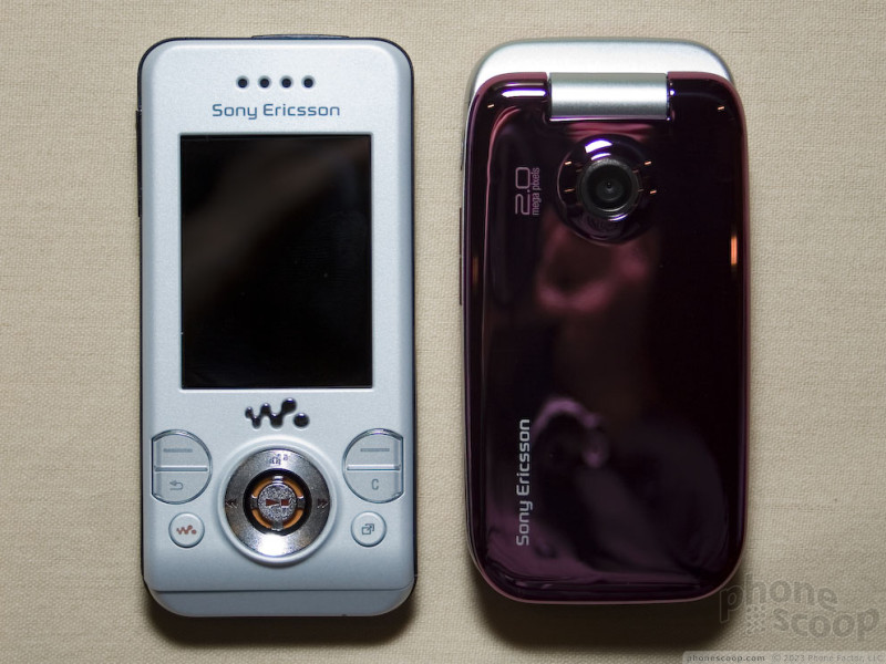
Sony Ericsson released just two phones for the US market at CTIA Wireless this week. While there was no word on which carriers will distribute the two phones, they are both slated for GSM carriers and pack features into designs that are easy on the eyes. The first is another entry in the popular Walkman series of phones, the W580. The second, the Z750, is an HSDPA clamshell that is a US variant of the Z610.
The W580 was definitely the star of the show for Sony Ericsson. The slider form factor is fairly thin (14 mm), lightweight and pleasing to look at. It comes with the bright orange accents that are part of the Walkman series signature and comes in two colors, though we only saw the white version at CTIA. When you pop up the slider, you are faced with an orange keypad, which is a nice touch visually. The keys were a little funky, though. The action was minimal and there was very little feedback to let you know you had activated the button, We'd go so far as to say that the quality seemed a little iffy, but that could be because we looked at it at the end of the day and the W580 had seen its fair share of action. The rep was unable to comment on whether the model we saw was a production phone or not.
The phone feels good in your hand, well-balanced, and solid. The action of the slider is smooth and it opened and shut without effort. The function keys on the top part of the slider all worked well and there was a reasonable amount of feedback from them. The D-pad felt a little weird. The silver ring of the D-pad has concentric ridges on it, so your thumb feels some texture when it moves over the D-pad. Also, the play/pause button in the center of the D-pad is raised and there's a small gap between the button and the inner part of the D-pad. This felt a little weird under your thumb. The screen was very bright and sharp and did a good job of displaying colors accurately.
The main user interface was similar to other Sony Ericsson phones. While using it, however, we stumbled onto a second, vastly different user interface. Rather than the 9 colored, animated 3D icons on the screen, there were "artistic renditions" of the icons in white over a black background. The selector indicator was a floating set of "bars" (think your old screen saver with the lines that travel and morph across your PC screen). The lines of this indicator system were rainbow colors and floated to each selection. It was pretty, for lack of a better word, artistic. The icons reminded us of the UI on the LG Prada phone. The drawback of the "artistic" UI is that it was a bit slow to react to your input on the D-pad. The lines really did float across the screen to the next icon, and took their time doing it.
Looking at the specs of the phone, it is very similar to the oh-so-similarly-named W850 slider for Europe. The 2 megapixel camera is in line with SE's other offerings and the W580 comes with the Walkman Player 2.0 application as well as fitness software, picture blogging and full html browser. It has a quadband GSM/EDGE radio, stereo bluetooth and an RDS-FM radio. It also comes loaded with 3D games from Electronic Arts so you can get yoru game on while rocking out to tunes.
Speaking of which, the music player sounded good. There was a reasonable selection of sample songs on the model we listened to. They employed top of the line Bose headphones and with them, the phone sounded really good, with rich, warm sound that wasn't thin or tinny sounding. It will ship with headphones and a 512 Mb microSD card.
Sony Ericsson's other phone for the US market is the Z750, which is a US-banded version of the Z610i. This Z750 is Sony Ericsson's first HSDPA phone for the North American market. It is tri-band HSDPA and quad-band EDGE clamshell that strives to make a fashion statement with its very smooth exterior skin.
The 750 is a very light phone. With the phone closed, the smooth finish feels good in yours hands. There are no edges that stick into your palm. It comes in pink and gray colors. The exterior display is hidden behind a mirror of sorts. When you hit the side buttons, the monochrome display lights up underneath the mirror. The effect is pretty cool. It was easily readable in the dark. We didn't get to look at it under direct sunlight conditions, but we can't imagine it will be very visible outside.
Opening is actually a bit of a let down, considering how stylized the outside is. The interior is a bland gray finish with no accents or coloration to make it more attractive. Still, the keypad was very usable and we had no complaints about how the D-pad worked and interacted with the menu systems, which are similar to other Sony Ericsson phones.
Aside from the HSDPA 3G connectivity, another feature setting this phone apart is that it is the first Sony Ericsson to support true push email service. It can be tied to an Exchange ActiveSync server to receive and send emails, as well as other Java-based email programs from third parties. The email in-box was below the SMS in-box in the 750 menu system. While the email UI wasn't very robust, it was perfectly serviceable in composing short emails, though the standard keypad kept us from typing too much.
The 750 has on-screen widgets that will stay in touch with any number of different wireless services and provide you with updates on things like stocks, weather and sports. The widgets were enjoyable to interact with. They will remain active even when the phone is in standby mode, so whenever you open it, the information is always up to date. This same interface can also display RSS feeds from your favorite sites.
The 750 also has features similar to the rest of Sony Ericsson's line, including a 2 megapixel camera and media player. The 750 is a good balance between style and oveall functionality. It has a solid feature list and the 3G radio will go a long way to help with its web and email applications.


 Review: Sony Ericsson Z750
 Review: HTC SMT-5800
 CTIA Fall 2007
 Review: Sony Ericsson W580i
 Video Tour: Pantech C150
 Motorola RAZR maxx Ve
 Pantech Ocean
 Samsung SCH-U540


