Review: Alcatel OneTouch Fierce for T-Mobile
Nov 15, 2013, 3:00 PM by Eric M. Zeman

Alcatel lands an entry-level device on T-Mobile's shelves in the OneTouch Fierce. This solid smartphone offers a good value for the budget-conscious shopper. android
Is It Your Type
For shoppers on a budget, the Alcatel OneTouch Fierce is a good value. It is an inexpensive Android smartphone that offers a pleasing mix of features, design, and quality.
Body
The Alcatel OneTouch Fierce is a mid-range handset that comes close to balancing the trifecta of good looks, powerful capabilities, and solid manufacturing. It's not too small, nor is it too big. The Fierce has a comfortable footprint and can be used easily by those with big or small hands.
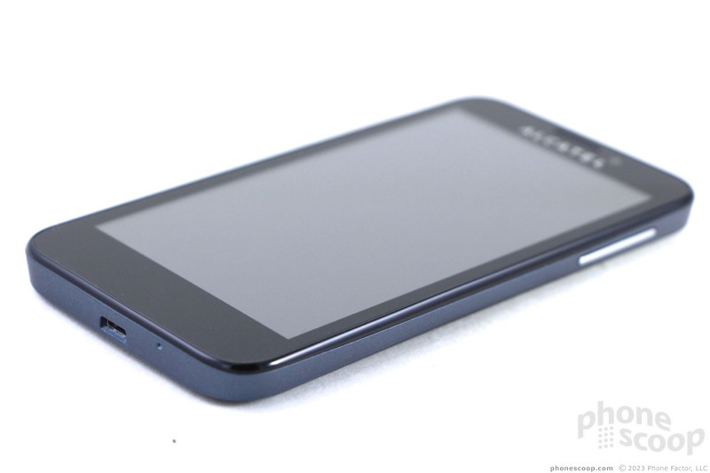
The Fierce borders on bland, but a few design choices help give it a wee bit of personality. It is an average-sized slab (about the same size as the Moto X) with a black face. It comes in two colors, either gray or blue. We reviewed the blue version, which has attractive chrome accents here and there that give the Fierce a smidgen of class. The blue is a nice color, and the back and sides have a slight scalloped line that makes the phone look thinner than it really is. The back and sides share the blue color and are coated in a soft-touch finish. It really looks good when outside under the sun.
The Fierce is pleasant to hold and interact with. It feels solid and well built, and the soft-touch surfaces give it some grip. I was able to hold it firmly without accidentally pressing buttons. The phone is definitely sturdy, though perhaps a bit heavy. It's not egregiously weighty, but it could lose a few grams. The quality of the materials is quite good, and the pieces are assembled tightly. It will certainly fit into most pockets, though the soft-touch finish often clings to the liner of one's pocket.
Alcatel filled most of the front surface with the display, but there's a noticeable bezel that surrounds the screen. It's not the worst we've seen, but it could be a hair thinner, especially along the sides. There's a slit near the top for the earpiece speaker and the Alcatel logo is directly beneath it. The logo is chrome-y, and often catches the light. The glass covering the display feels good, and it's rimmed with a slight lip that prevents it from being scratched when placed face-down on flat surfaces. There are no physical buttons, as the Fierce uses capacitive keys below the screen. They don't light up often enough and can be hard to see at times.
The volume toggle is on the right edge of the Fierce. It stands out visually thanks to the chrome coloring, but it has a crummy profile and even worse feedback. It's not satisfying to use at all. The screen lock button on the top of the Fierce is only slightly better. It's easier to find, but travel and feedback aren't great. The headphone jack is also on top, while the micro-USB port is tucked into the bottom edge of the phone. There are no controls or ports along the left edge. The Fierce doesn't have a dedicated camera button.
The camera module is positioned on the back, near the top and is ringed with a chrome accent. There's a small flash directly below it. The back cover forms the entire rear surface of the Fierce. There's little a notch in the lower-left corner that's a perfect fit for your thumbnail. The cover peels off easily. Once removed, you have access to the SIM and memory cards. The battery, however, is sealed in place. That stinks.
In all, it's a solid piece of hardware.
Comments
LTE.?
To notice a transition from hspa+ to LTE. When the device is not LTE capable. It's a hspa+ 21 device only.? 🙂
Eric's review is consistent with my experience with this device. I have to say that this review is 100% objective.


 T-Mobile Intros the Alcatel Fierce and Evolve
 Hands On with the Motorola razr and razr+ (2024)
 Newcomer Schok Makes Splash with Feature-Rich Phone for $169
 Alcatel Fierce


