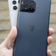
Hands-On: HTC One
Mar 25, 2014, 10:15 AM by Eric M. Zeman

Here are some quick and dirty thoughts about the HTC One, which has an all-metal design, 5-inch HD screen, and a rewritten user interface.
source: HTC
HTC One
HTC today showed off the One, its brand new flagship smartphone for the year. The device uses the same name - the One - as last year's flagship. Along with the name, the new One carries over the design language and many features from the 2013 model. There's plenty new stuff to like, though. Here are a few quick thoughts.
It may be hard to believe, but HTC actually improved the One when compared to last year's phone. This year's One has more aluminum, and the metal now wraps fully around the back of the phone and forms the side edges as well. Aside from the glass front and some narrow bands of plastic, the One is mostly metal.
The new One has softer corners and edges than the old One, and is slightly taller. It is being offered in three shades: dark gray, silver, and gold. All three shades feature a brushed aluminum exterior that feels exquisite. HTC said it made an effort to soften the look and feel of the phone. The edges have more aggressive tapering and are less sharp. The black plastic bands (white on the silver model) cross the back in two places, just as with last year's phone. The screen on the front also has a nice band that provides it with a nice frame.
The aluminum is smooth almost to the point of being slippery. The back panel is gently curved to allow the One to sit deeper in your hand. There are no hard corners or seams. The chamfered side surfaces are angled perfectly to meet the glass. As good as it feels, there's no denying that the One is a big phone. It's not overly heavy, but it isn't light, either. It may be too big for some. Materials and build quality are second to none. Only Apple makes hardware in the same class as this.
The One's front face has the BoomSound dual-speaker setup. HTC has done away with physical buttons on the One and now uses the on-screen control buttons that are part of the Android operating system. This is a welcome change. The screen, which measures 5 inches, has plenty of bezel above and below, but minimal bezel along the sides. This gives the One a bit of an oblong look.
The SIM card tray is located along the left edge of the One. Both the micro-USB port and 3.5 mm headphone jack are positioned on the bottom edge of the One. The volume toggle is on the right edge; it is a thin strip that has a reasonably good profile. Travel and feedback are decent. The memory card tray is positioned on the right edge and also requires a SIM card tool or paperclip to eject. The screen lock button is on top. It is placed in a strip of black plastic. This strip also houses the infrared transceiver. The button itself has a low profile. I wish it were easier to find with my finger, but travel and feedback is all right.
The battery of the One is sealed inside. The aluminum back panel also forms the side edges, and it cannot be removed. The back panel houses two cameras, a dual-LED flash, the NFC radio, and microphones for recording audio.
The 5-inch 1080p HD screen looks great. It is sharp, bright, and colorful. It is a Super LCD 3 panel and offers great viewing angles.
The Sense 6.0 user interface feels incredibly fast. The One has a Snapdragon 801 processor under the hood, and it provides plenty of boost for the Android operating system and Sense overlay.
One neat-o accessory that HTC announced today was the Dot View case. It is a wrap-around case that has large dots on the side that covers the screen. When attached to the phone and the case is closed, the One's UI sort of changes a bit. It will use large dot-matrix lettering - which is visible through the case's actual dots, to show some basic lock screen items, such as the time, and incoming call/message alerts. The case itself is simple, but puts the phone into a specific mode to interact with it. The case costs $50. It is available first in gray and eventually in orange and green, too.
Based on our initial impressions, the One is going to be a big hit with consumers this year.
Here's a close-up look of the one One (silver) and the new One (gray).
Comments
No messages


 Review: HTC One for Sprint (Harman Kardon Edition)
 Review: HTC One for Verizon Wireless
 Review: HTC One
 HTC One Owners Can Now Share Duo Cam Shots Via Gallery App
 HTC to Offer BlinkFeed and Zoe Apps to Other Phones
 HTC One (M8) (CDMA)
 HTC One (M8) (GSM)


