Review: Apple iOS 8
Sep 22, 2014, 8:00 AM by Eric M. Zeman
updated Sep 23, 2014, 1:41 PM

Apple's newest operating system for smartphones and tablets may look a lot like last year's, but it is a significant improvement in many ways that won't be obvious right away. Apple added tons of user-facing changes, but the important updates are all aimed at developers. Here is Phone Scoop's in-depth report on iOS8.
Apple's iOS 8 represents a major update to the company's smartphone and tablet operating system. Visually, little has changed from last year's iOS 7. The bulk of the changes are under the hood, with a bevy of new features both visible and invisible. Everyday users of the iPhone will be happy with the added capabilities, but iOS 8 is really for developers. Apple made an incredible number of adjustments to what developers can do with their own apps - the effects of which won't be fully realized for some time. Suffice it to say, apps are about to get a lot better for the iPhone and iPad. Here is Phone Scoop's in-depth look at Apple's latest mobile operating system.
Design
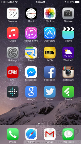
Apple refreshed the look and feel of iOS last year. iOS 7 was a completely new design compared to iOS6 and earlier versions. WIth iOS 8, Apple builds on the foundation set by iOS 7 without making any massive shifts in appearance.
The operating system uses prodigious amounts of white space to define design elements throughout. The color palette sticks to pastels and grays, which, to be honest, I find more and more cheesey every day. The design is still elegant and modern, but I've grown tired of the colors faster than I thought I would. The fonts are truly modern in a minimalist way, with ultra-thin letters adorning menus and control panes. Circles are everywhere. The buttons within the phone app, the photos for your favorite contacts, and other UI elements appear as circles rather than squares or squircles.
On the whole, iOS 8 a decent-looking operating system that is generally easy to use thanks to dead-simple controls made obvious by Apple's designers. When weighing the differences between iOS and Android and Windows Phone, iOS is the clear winner in usability.
Comments
quick settings
(continues)


 Samsung Refreshes Galaxy S Series with S Pen, New Cameras
 iPhone 14 Plus Offers a Big Screen For Less
 Snapdragon 8 Gen 2 Redefines AI in Flagship Phones
 Hands On with the 2023 moto g 5G & moto g stylus
 Hands On with the moto g stylus 5G (2023)


