Hands-On: BlackBerry Passport
Sep 29, 2014, 6:38 PM by Eric M. Zeman

BlackBerry says "We're back!" with the Passport, a smartphone that breaks new ground in some respects. Here are our first thoughts.
Passport
BlackBerry is hoping the Passport can help revive interest in the flagging brand. The Passport, which has a physical QWERTY keyboard, is an emailing machine. It boasts one of the weirdest designs to reach the market in recent memory, but maybe that's a pro and not a con. Here are our first impressions.
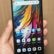
The Passport is an odd-shaped device, there's no other way to describe it. The phone is about the same size and shape as a standard US passport, which is to say a rectangle - but not a thin one. Devices like the HTC One, Samsung Galaxy S5, and iPhone 6 Plus have a 16:9 screen, and a narrow look to accompany that display. The Passport is especially wide to accommodate the keyboard and square 4.5-inch screen. The screen consumes the bulk of the device's front face, and the keyboard sort of looks like it was tacked on for good measure.
To me, it feels way too wide for everyday use and it's more than a tad awkward when stuffed in your jeans. I'd call the Passport a two-handed device. It's not really a phablet, per se, but it isn't a standard smartphone, either. I could not reach a significant portion of the screen without repositioning the phone in my hand first, though BlackBerry has done its best to minimize this with the gestures built into BBOS 10.3.
The materials and build quality are quite good. BlackBerry has typically made strong devices that are appealing in terms of their build, and that hasn't changed with the Passport. The plastics, glass, and other materials used are pleasing to the touch. I didn't see any issues with the seams and everything is snapped together tightly. It is thick, though, and heavy. If you like dainty phones, the Passport is not for you.
They keyboard is way too wide for me. I prefer narrower keyboards - like those on BlackBerry's original, legacy devices. I find them to be faster and require less movement of my thumbs. The Passport's keyboard, which does offer great tactile feedback, is just wide enough that I felt like my thumbs were sprawling all over the place to reach the keys. That said, the buttons have a pleasing shape and offer excellent travel and feedback. The action should please BlackBerry aficianados. However, the keyboard has only three rows, where the company's older designs have four. To combat that issue, BlackBerry created a virtual fourth row that appears on the screen above the physical keyboard when needed. It takes some getting used to, for sure. In a novel move, BlackBerry has made the entire keyeboard touch-aware. That means you can swipe on it - just as you would a touch display - to perform certain actions. There's a bit of a learning curve here, though, and I didn't find it all that intuitive, at least at first blush. It works on HTML-based content, such as the web browser and within emails.
The screen measures 4.5 inches across the diagonal and has 1,440 x 1,440 pixels. That puts it somewhere in the "HD" spectrum. I think it looks really good. It's not ideal for watching videos, that's for sure, but BlackBerry claims it helps show more characters (in an email) per line. That's certainly true, but there are obvious trade-offs. BlackBerry OS 10.3 has been adjusted to fit the Passport's screen, much like the Q30. It basically crops off the bottom XX% that might be seen on a device such as the Z30, which has a 16:9 aspect ratio. In other words, if you've used a Q30, you'll feel right at home.
There are no controls along the left side of the phone, but BlackBerry has its standard trio of buttons on the right. There are the up and down volume buttons, separated by the user-assignable action key. These buttons are rather slim and don't have good travel and feedback. I can say the same thing about the screen lock button, which is on the top. It is a bit hard to reach and has rather wimpy travel and feedback. The headset jack is on top and the microUSB port is on the bottom.
If you're looking to swap SIM or memory cards, they are hidden behind a flap near the top of the phone. The topmost 20% of the back cover is removable, but it only permits access to the card slots. The battery is built in and inaccessble.
The Passport is certainly interesting. It's not something I'd carry on a day-to-day basis, but I can see how some email addicts might like it. Even then, it is awkward to use and has a numbe of compromises with its built-in battery and limited keyboard. Further, BlackBerry is selling it unlocked at the moment for $600. Unless an operator steps in and discounts it heavily (AT&T is supposed to do this soon), it's far too expensive for regular people.
Comments
question
I have two questions, 1- witch phones nowadays it's not on the trend of non-removable batteries? What flagship smartphone nowadays have removable battery?
2-"limited keyboard"? For real? Tell me about other phone where the keyboard it's a touch pad at the same time?
I know it's not a iPhone that's why it has flaw's, we already know that.
a2. I said "limited" because it has three rows instead of four, which has long been a staple of BB devices. The buttons don't even seem to have alternate letters/characters, y...
(continues)
Balance
If they can regain a marginal interest in their ...
(continues)


 AT&T Reveals BlackBerry Classic and Passport Pricing
 BlackBerry Shows Off the Passport for Mobile Pros
 BlackBerry Passport


