Hands On with the HTC U Ultra and U Play
Jan 12, 2017, 3:30 AM by Rich Brome @rbrome.bsky.social
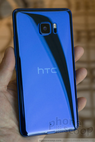
The HTC U Ultra and U Play are the company's new high-end phones, replacing the iconic HTC 10 and One series. They sport flowing 3D curved glass on the back, and high-end specs. The U Ultra also has a secondary touch screen above the main display. The U series also includes a learning AI assistant, as well as traditional HTC features like UltraPixel cameras, BoomSound Hi-Fi, hi-res audio, and HTC Connect for wireless media streaming. What are the U phone like in person? We checked them out.
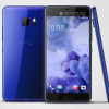
The U series marks HTC's departure from their iconic unibody metal designs. To replace it, they've come up with a unique flowing glass design language that they call "Liquid Surface". The glass is curved not only at the sides — like many recent Samsungs — but at the top and bottom, too. This is very difficult to manufacture with precision.
Glass is makes it easier to incorporate the growing number of antennas that high-end phones need to include. But it's also prone to breakage, and the U series exposes more glass to more drop angles than any other phones to date. That presents a conundrum: the very thing that makes it so pretty also requires that you cover it with a case.
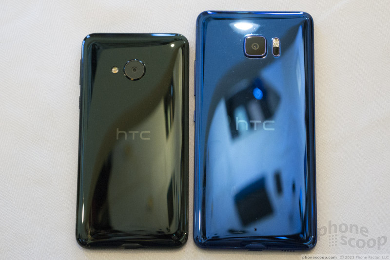
The two U series phones (U Ultra and U Play) are very similar on the outside, differing only in size and the shape of the camera hump (rounded square vs. circle, respectively.) Once you start using them, you'll notice that the U Ultra also has a secondary display above the main one. But otherwise, the design is the same, right down to the color choices.
The color choices are blue, black, white, and pink. The blue is a very pretty shade that should appeal to anyone. The "black" reveals a dark green shimmer in certain lighting; it's a unique and attractive effect. The white and pink both change color quite a bit depending and lighting and angle. The effect is pearlescent, a bit like the surface of a soap bubble. It doesn't photograph well, but in person, it's striking and changes dramatically as you move the phone around. The "white" can look peach or pink or green, depending on lighting. This effect is produced by a process HTC calls "optical spectrum hybrid deposition". It's pretty.
The phones have the high-quality feel we've come to expect from HTC. The metal frame feels solid and has a nice matte texture. The metal and glass together make the phone feel like a fine luxury item. Two details are perfect. The rounded sides and curved glass help make this thin phone feel even thinner. Yet the sides are just large enough to provide a comfortable grip surface, and buttons that are just thick enough to use comfortably. The buttons work well, and I'm glad to see HTC keeping the strong notched texture on the lock button that makes it so easy to find by feel.
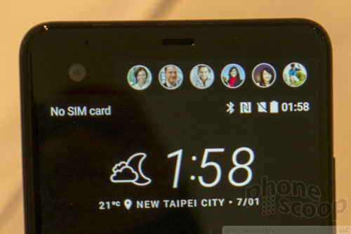
The second display on the Ultra provides a dedicated space for important notifications and shortcuts. It's a touch screen, allowing you to swipe left and right to access different modes, such as a strip of contact thumbnails so your favorite people are always at your fingertips. (In this respect, it reminds us of the Edge Display on the first Samsungs with a curved display. But of course this implementation looks more like the LG V20.)
By default, it displays important notifications, so they don't pop up on the main screen and take away from the full-screen game you're in the middle of, for example.
The U Ultra is smart enough to ignore touches on the secondary screen when it knows you intend a gesture on the main screen. Specifically, you don't have to worry about the second screen getting in the way when you swipe down from the top to see the full notification shade.
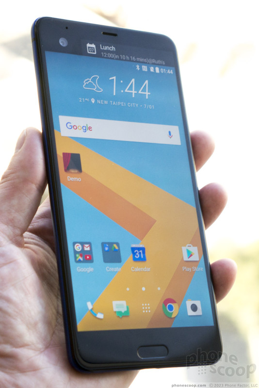
Both screens are extremely sharp, bright, and look great.
The U Ultra is a bit large with its 5.7-inch display, although the thin side bezels help a lot. The U Play is much friendlier to smaller hands with its 5.2-inch display. I'd love to see some version of the U Play come Stateside, but sadly that doesn't seem to be in the cards for now; just the U Ultra is coming to the U.S..
The U Ultra has BoomSound Hi-Fi Edition, which means it has a separate tweeter and woofer when in loudspeaker mode. It's not stereo. Like the LG V20, it has other high-end audio features, including Hi-Res audio and four (four!) microphones, for ideal noise suppression and 3D audio recording.
Both the U Play and U Ultra come with the new HTC Sense Companion. It's an AI assistant that learns who and what's important to you, in order to customize the phone and make intelligent suggestions. As HTC explained it us, it seems to involve a lot of pop-up notifications suggesting things to do (charge your phone, grab an umbrella, take an alternate route, etc.) If it's perfectly smart, it could be useful. But even the smallest flaws could make this feature highly annoying. We very much look forward to testing out this feature in our review, as this type of feature can only be properly evaluated over time.
The software on the units we tried wasn't final, so we can't say much more about that aspect, but it seemed very similar to what we've seen on HTC's 2016 phones, just with Android 7.0 (Nougat). That's mostly a good thing.
The U Ultra will set you back $750, which is at the top end of what you can charge for a flagship phone these days. It does have most features and specs you'd expect at that price, except for wireless charging, and its water resistance is minimal (light rain only.) It seems like a very promising flagship phone, but whether it's a good value is debatable.
Comments
No messages






 Review: HTC U Ultra
 HTC Cuts Price of U Ultra to $599
 HTC U Ultra to Ship March 10
 HTC to Drop Entry-Level Phones, Focus On Profits
 HTC U Ultra Is New, Glass-Backed Flagship Phone
 HTC U Ultra

