Review: HTC U Ultra
Lock Screen
The U Ultra runs Android 7 Nougat with HTC's Sense interface on top. Sense has its own spin on the lock screen experience. I'm a fan.
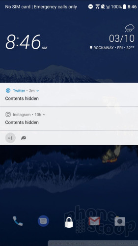
The lock screen shows the clock, notifications, and shortcuts whenever the lock or home buttons are pressed. I like that the clock includes the weather details for your current location, though the time is shown in a too-small font. As per the norm with Android, you can select how revealing notifications are.
Notifications put the secondary screen to good use. Rather than wake the main display, the small screen lights up with incoming notifications, such as text messages, emails, and so on. The notifications remain on the display for a few seconds before it turns off. HTC selected a huge font and uses really big icons so you can tell the difference between an email notification and text message notification from several feet away. Tap the notification to take action.
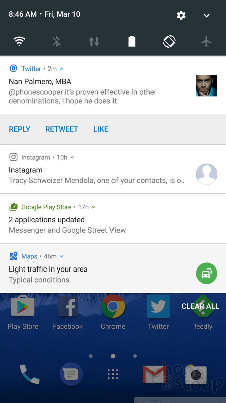
The Quick Settings panel is accessible from the lock screen, as is the full notification shade where you can respond to messages and more. These act as any stock Android phone might. The lock screen shortcuts, of which there are five, mirror whatever apps you've set in the home screen dock.
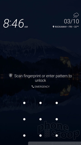
The U Ultra's fingerprint sensor is easy to train and easy to use. You may instead opt to use a PIN, pattern, or alpha-numeric password. The U Ultra's sensor is on par with the fingerprint readers on iPhone 7 Plus and Google Pixel XL. It's definitely quick enough to be used as your primary unlocking method.
Home Screens
HTC's Sense interface skin allows for an incredible amount of customization on the U Ultra. While it sticks to many core Android basics, HTC has given U Ultra owners plenty to tweak.
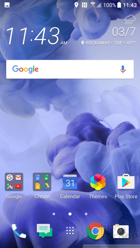
The home screen panels are fully customizable by end users and hold plenty of apps, shortcuts, and widgets.
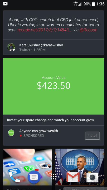
Blinkfeed, HTC's social newsreader, is active as the left-most home screen panel when you first boot the phone. You can use it to generate a feed from Twitter, Facebook, and a handful of third-party news sources. One extremely annoying thing: Blinkfeed contains ads. If you choose to swipe over to Blinkfeed, chances are the first thing you see will be an advertisement. This is not the homescreen experience I want. You can disable some ads, but the switch is buried pretty deep in the settings. You can also disable Blinkfeed completely.
HTC left the Quick Settings panel alone, meaning it looks and acts like stock Android, but the company gave the settings menu its own fonts and colors. These core tools are easy to access and use.
The Sense app drawer offers a lot more flexibility than the stock Android version, as it allows users to arrange apps alphabetically, in custom order, or via most-recently-used. It also lets people change the size of the grid. I wish the app drawer scrolled smoothly; instead, it jumps vertically between full pages. The app drawer does include a search tool and supports folders.
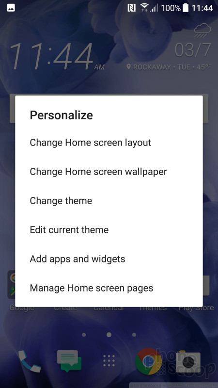
The U Ultra includes a handful of pre-installed themes. The themes can be tweaked with various accent colors, wallpapers, keyboards, icons, fonts/sizes, and on and on. HTC's Freestyle themes — fully customizable — are available, as well. You have to create an HTC account to download the coolest stuff.
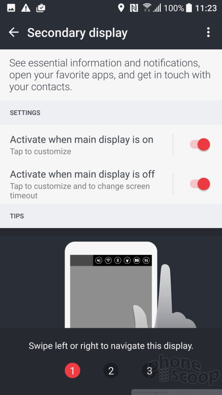
Curious about that extra display? It actually does quite a lot when the phone is awake, too. It features six distinct screens: app shortcuts, contact shortcuts, custom reminders, calendar, music controls, and the weather. The extra display is always on whenever the main screen is lit up. It shows whichever of the six screens you used last. You swipe side-to-side to access the six different functions. Thankfully you can access the Quick Settings shade without messing with the second display.
You can fully customize the app and contact shortcuts, selecting up to six each. The contacts shortcuts don't take you to the contact card; instead, pressing one of the little heads will let you call or text that person. The weather helpfully displays what's going to happen over the next few hours, rather than the next few days. The calendar screen shows your next appointment, whatever it happens to be. Incoming notifications will obscure the screen for a few seconds, but the interactive screen returns once the notification goes away. I like that the extra display is also fully accessible from the lock screen. The music controls tie into to whichever music app you use, be that Play Music, Spotify, or YouTube Music.
One thing is missing at launch: HTC Sense Companion. HTC developed its own personal assistant that's supposed to be able to learn the owner's habits, etc., to generate recommendations throughout the day. HTC says Sense Companion won't arrive until late April, so we can't offer much in the way of an assessment. I will say this, however: the Google Assistant hit my review unit this week and I've already taken to it. With the Google Assistant available, it remains to be seen what appeal Sense Companion will have when it arrives.
The U Ultra is powered by the Qualcomm Snapdragon 821 with 4 GB of RAM. This is the same chip that's found in the HTC-made Pixel XL and it does a fine job. The U Ultra ran smoothly with no issues whatsoever. All of the apps opened swiftly, screen transitions were liquid-like, and the phone rarely got warm.
Camera
You won't find a dedicated camera button on the U Ultra, but a quick double-press the lock button will launch the camera in a blink. You can also launch the camera from the lock screen and from the home screen. One thing worth noting: this camera launches in whatever mode was used last, such as the selfie cam.
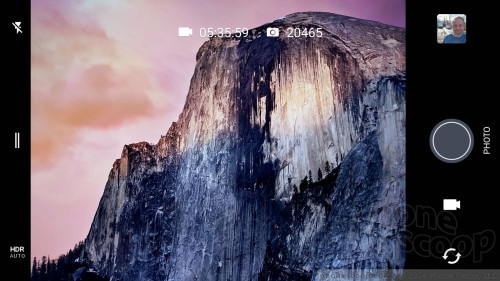
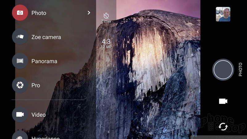
The camera app itself is mostly a carryover from other HTC phones. The user interface is clean and simple, and I appreciate that. A few settings are available along the left edge, and all the shooting controls are on the right. The U Ultra has separate buttons for snapping pictures and capturing video. This means you don't have to change modes to record video, and you can easily take pictures while recording video. The front camera button is on the right, as is access to recent photos.
When using the standard camera mode you can quickly set the flash and HDR to on, off, or auto. If you want to do more, swipe open the little drawer on the left side of the screen. This reveals all the Photo modes (normal, Zoe, panorama, pro), Video modes (normal, time lapse, slow-motion), and Selfie modes (picture, panorama, video). Grouping the shooting modes this way really simplifies the interface, but it takes a lot of scrolling to find the mode you want. I wish they were available on a single screen.
The auto shooting mode lets you control the flash and HDR and that's about it. The Pro shooting mode gives you control over white balance, exposure, ISO, shutter speed (up to 16 seconds), and focal points. The sliding tools for adjusting these are straightforward. I love that you can save three custom Pro shooting modes. This is totally cool. Pro mode also allows you to capture RAW images, which offer more potential for fixing exposure and white balance after the fact.
The Zoe mode takes a combination of pictures and video lasting about three seconds. This feature has been around for a while.
The dedicated selfie mode includes HTC's beautification filter, several countdown timers, and a screen-based flash that first checks white balance and then fires the shot. These all help get that perfect selfie.
Once you learn to navigate the app, the camera is quick and light on its feet. The only thing I disliked is the sluggish HDR Auto mode. The camera is really slow when capturing HDR images. HDR defaults to the Auto setting, so if you notice the camera isn't capturing photos fast enough be sure to turn HDR Auto to off.
Photos/Video
The HTC U Ultra has a 12-megapixel camera with optical image stabilization, PDAF (phase-detection autofocus), and an aperture of f/1.8. It's the same sensor we fell in love with in the Google Pixel. Other technical features include optical image stabilization, two-tone flash, and laser focus. I was very pleased with the camera's performance.
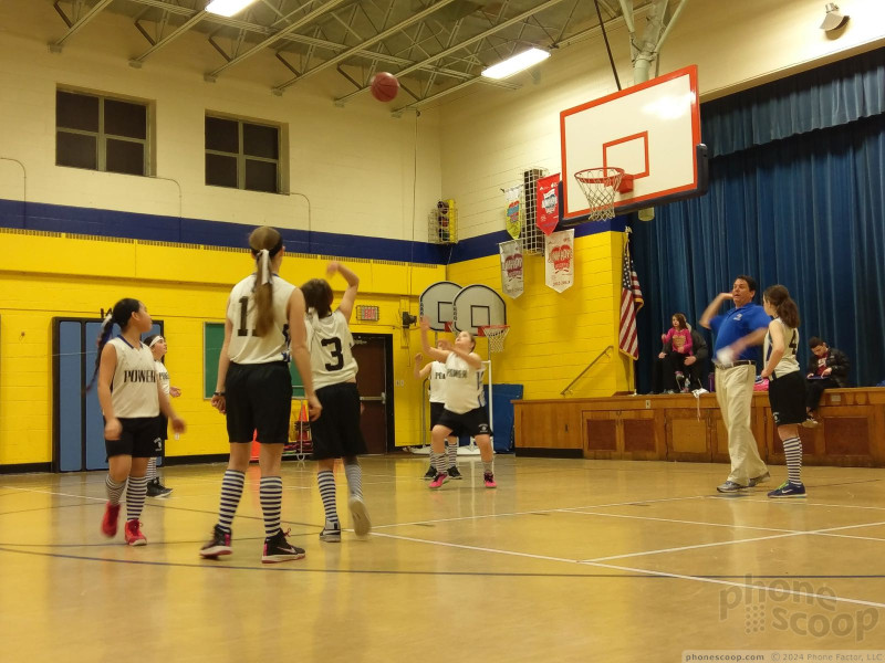
I found focus to be consistently excellent. The one-two punch of laser and phase-detection autofocus means you obtain incredibly sharp images. Colors are accurate, too. Samples below such as the toy laptop and balloon are 100% when it comes to color representation. The HDR function, slow though it may be, impressed the heck out of me. I aimed the camera directly at the sun with some trees in the foreground. Amazingly, the exposure is perfect. This main camera does a very, very good job and most everyone will be happy with it.
The selfie camera isn't quite as good. It has a 16-megapixel sensor (which is a lot!) but it doesn't deliver the goods. Exposure is decent, as is color accuracy, but you can see in the sample below that focus is very soft. I am glad that the selfie cam includes a panorama mode to let you take insane wide-angle selfies. I just wish focus were sharper.
The video camera works well, too. It's able to capture 4K video, but you'll probably be best served by sticking to normal 1080p HD. The video I shot was sharp, colorful, and accurately exposed.
You can easily use the HTC U Ultra as your main imaging device on most occasions. It is on par with most other currently-available flagship phones.
















 Hands On with the HTC U Ultra and U Play
 HTC Cuts Price of U Ultra to $599
 HTC U Ultra to Ship March 10
 HTC to Drop Entry-Level Phones, Focus On Profits
 HTC U Ultra Is New, Glass-Backed Flagship Phone
 HTC U Ultra


