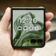
Review: Samsung Glyde
Let's start by saying, it ain't no iPhone. Nothing on the market has yet to compare to the instant reaction the iPhone has when touched. That said, the Glyde's touch screen is reasonably responsive and offers haptics, which the iPhone doesn't.
What I really want to say is that the Glyde does not have a touch UI, it has a "push" UI. If you want something to happen, you don't just touch the screen. You have to push it.
This can be accounted for, mostly, if you fiddle around with the sensitivity settings. I had to put it up all the way to get it to my liking. Each time you press the screen, you are rewarded with a nice little micro vibration to let you know you've activated it. The vibration is general, and not exact. In other words, the entire device vibrates; the haptics are not specific to the exact area you touched.
Any menu that is longer than the screen allows for can be dragged up or down. You can sort of flick them up and down, but there's often a delay. You also have to press the screen several times on occasion in order to get a reaction from the Glyde.


 Samsung's Glyde Slides Open at Verizon
 Samsung U940 Hurdles FCC
 Samsung Refreshes Galaxy S Series with S Pen, New Cameras
 Samsung Refines its Foldable Phones
 iPhone 14 Plus Offers a Big Screen For Less
 Samsung Glyde U940


