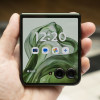
Review: Motorola krave ZN4
Tapping the dialpad icon on the home screen (with the touch cover up) delivers an alphanumeric dialpad with white keys. Switching the dial font size from normal to large in the settings menu did not seem to change the size of the dialpad or the tapped number display one iota.
You have to flip up the touch cover to answer the phone. When you bring the phone to your ear, the screen goes blank and its touch capabilities turned off. When you bring the phone down away from your face, the screen lights back up. You then have to hit a seemingly redundant on-screen "touch to unlock" screen button before you can end the call.
Contacts fields include all the usual data – multiple phone number and email choices, a picture and personalized ringtone selection. There's also room for a fax number but no space for snail mail addresses. If there are multiple phone numbers or email addresses, there's a radio button to indicate the default choice to appear beneath the name in the finger swipe scrollable contact list.
When you add a name, you have to rotate the phone sideways for the QWERTY keyboard to appear; in portrait mode you get only an alphanumeric dialpad. But when typing names on the QWERTY, not only don't you get auto caps on first and last names (most phones move to auto cap after a space), but the keyboard stays in uppercase instead automatically reverting to lower case after you tap the first letter.


 Verizon Kraves the Motorola ZN4
 Hands On with the Motorola razr and razr+ (2024)
 Motorola Adds 5G to its 2022 Mid-Range Lineup
 Newcomer Schok Makes Splash with Feature-Rich Phone for $169
 Motorola's new Edge Offers a Lot for $500
 Motorola Krave ZN4


