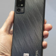
Review: Samsung Impression
Apr 14, 2009, 9:17 PM by Eric M. Zeman
Samsung gives AT&T a touch phone that packs a full QWERTY, 3G, TouchWiz and a 3 megapixel camera. Is there anything unimpressive about the Impression?
Form
Is It Your Type?

The Samsung Impression would appear to have it all: Good looks, large touch screen, solid keyboard, and a host of attractive features. If you're the heavy messaging type and want a physical QWERTY keyboard, but still like the appeal of a touch screen, the Impression, well, impresses... for the most part.
Body
The Impression is not a small phone, but it's not egregiously large, either. It is about the length of an iPhone, but is noticeably thinner from side-to-side, while being a bit thicker from front-to-back. The display is generous and finger friendly. It is somewhat comfortable to hold in your hand, though the width may bother some. The rounded edges all around help a lot when slipping it into your pocket as well as retrieving it from same. Due to its size and weight, you will notice that it is in your pocket, no doubt.
There are but three buttons on the face of the phone. The send/end keys and a clear/back key between them. All three have good travel and feedback, but I thought they were a bit on the loud side. They have a definitely "clackyness" to them.
On the left side of the phone you'll find two keys. One located near the top of the phone is an app switcher key that brings up a list of open applications. This button is hard to find, and has minimal travel and feedback. The volume toggle is below it, and is much easier to find, with better travel and feedback. The right side of the phone has a dedicated camera key and the now-familiar Samsung touch-phone lock/unlock key. The camera key stands out nicely and is a cinch to find. The lock/unlock key is not. This is a real flaw in my mind, because users will constantly be pressing the lock/unlock key to awaken the phone or put the display to sleep. Give the frequency of use, this button should be much easier to find and use. It has negligible travel and feedback. Not good.
The top of the phone houses the charging / data / headphone port. Peeling back the hatch is easy enough, but I am tired of Samsung's insistence on bundling all three of these together with a proprietary connector. Where's the regular headphone jack?
The Impression is a sideways slider. Pushing the front half to the right reveals a four-row QWERTY keyboard. I really like the feeling of the keyboard. The buttons have the perfect amount of contour to them so they stand out and are easy for your thumbs to find. Composing messages is quite a breeze, and I found the QWERTY comfortable to use. The phone is well balanced when open, so I didn't experience any finger fatigue when typing. The one thing I don't like about it is that there number keys are overlaid on the left-hand letter keys in a number-pad shape rather than spread across the top row of the keyboard. Otherwise the layout makes sense.
One thing I'll say is that the sliding mechanism didn't feel all that great. There's some roughness to it, and there's some obvious friction that doesn't feel right. I don't know if dirt got into the tracks of my review unit, or what, but it feels a bit gritty and unpleasant to open/close.
If you want to swap out the microSD card, you're going to have to remove the back cover to do so (you don't have to remove the battery). Not the most convenient place in the world, but we realize most users won't be constantly swapping cards in and out.
The Three S's
Screen
The Impression has an OLED screen with 240 x 400 pixels. This should be enough to get your juices flowing, but quite honestly, I didn't care for the display at all. It is suitably bright and colorful, no doubt. But the (what I thought was) low resolution for the size of the screen led to it constantly looking out-of-focus. (Yes, I removed the sticker protecting the display). Text, icons and such all has a slight haze to it. There's no other way to describe it. Everything was perfectly visible in bright sunlight, though.
Signal
The Impression did quite a good job at connecting to AT&T's network. Over the Easter holiday weekend, I took it to the local vault (ShopRite) repeatedly (because I am absent-minded and needed to make multiple trips), and it held onto a signal in there, and was able to make and receive calls with no problem. Other areas in Northern New Jersey where I brought the Impression didn't appear to tax it, and it had at least two bars of signal strength in most locations. Compared side-by-side to other AT&T phones, it matched them nearly identically in ability to remain connected to the network.
Sound
The Impression will ring loudly enough so that you're not going to miss calls in most instances. It isn't ear-drum-piercingly loud, but it is loud enough. The vibration alert can be set to varying different patterns, and you can have the phone vibrate before the audible ringer starts. The vibrate is also nice and strong. I didn't miss any calls through lack of hearing the Impression or feeling it. Call quality wasn't bad. Voices in the earpiece were clear enough, though there was a hint of hiss. I would have preferred it if I could make the earpiece volume louder. I had trouble hearing several callers whilst walking around the local mall.
Battery
We've had the Impression less than a week, so we don't have a definitive report for this section. In our time with the phone, it performed adequately in the battery life department. I killed a full charge between 7PM on Friday and about 11PM on Saturday. That was with heavy voice and Internet use. I charged it overnight Saturday into Sunday, and it still has half a charge on Monday, but I used it less on Sunday. We'll add more here as we test the phone further.
Touch
The Impression uses a resistive touch screen matched with Samsung's TouchWiz user interface. The screen works well enough. The strength of the haptics can be controlled by the end user, and I found it had fewer false positives than other Samsung touch-phones. Even though it's an improvement over devices such as the first Instinct and Glyde, I still feel like the resistive touch screen is a bit finicky.
Basics
Menus
The Impression uses Samsung's TouchWiz user interface. The best part about TouchWiz is the home screen. The home screen is a fully customizable desktop area where you can drag and drop widgets and shortcuts to pretty much any application you want. When you first get the phone, you'll see a little tab on the left side of the screen close to the top of the phone. Touch this tab and a dock pops up from the left side, similar to the dock in Mac OS X. The dock is easily opened and closed with this little tab. Here, you can snag the widgets and drop them onto the desktop, or you can take them from the desktop and drop them back into the dock. You can also open applications directly from the dock.
There are 20 widgets in the dock, though only about 6 fit on the screen at any one time. You can scroll the dock up and down to see the other widgets in there. Using the menus, you can control which widgets are visible and which aren't. The default is to make them all visible.
The home screen also holds three permanent icons at the bottom: Dial, Contacts, and Menu, It doesn't take a rocket scientist to figure out what each of them does. The main menu holds 12 icons for AT&T's services in a basic grid. All the subsequent menus that you find as you dig deeper into the phone are lists. You can't change the way any of these menus look. What you see is what you get.
Calls/Contacts
Hit the send key and the Impression opens up a list of all your calls. There is a little drop-down menu near the top that you can use to filter by dialed, called, missed, etc. There is a little green phone icon next to each call. Touch that icon, and the number is dialed.
Touch the actual number itself, and the phone opens up the information about that call. With the call information open, you can choose to save it to the phone book, delete the call record and a few other things. There is a button just below the call record that when pressed will start a call. Pressing the send key does the same thing. There is a separate software button if you would like to send a message to that number or start a Video Share session with that number.
If this is all just a bit too fancy for you, touch the phone application on the home screen instead. It brings up a dialer. The software numbers on the 12-key dialpad are nice and large. Dialing is easy.
Each contact has two icons next to it, an envelope and a phone. Press the envelope to jump into a text message screen and the phone button to make the call. At the top of the screen is a little drop-down menu that lets you see all your contacts, groups or your favorites.
If your list of contacts is extensive, you can easily zoom through them with a slider tool that is part of the contacts app. It appears on the left edge of the screen. Place your finger on it and drag it up or down to zoom through your contacts quickly.
A button on the bottom left corner is what you want to press to save a new contact. You can add multiple phone numbers, email addresses, street addresses, sent ringtones or vibrate alerts. If the default number of fields isn't enough for you, you can add more. There doesn't appear to be a limit to the number of fields you can add.
Messaging
All of your messaging services are in the messaging menu. SMS, IM, email, it's all in there. The first choice is to start a new SMS. Open it up, tap anywhere on the screen and the 12-key keypad pops up. You can enter text via triple-tapping or T9 if you wish. Open the phone if you want access to the QWERTY keyboard.
Composing messages is easy enough. I liked how easy it is to drop in text templates. Predictive text works both with the software numeric keypad and the full QWERTY keyboard. Emoticons are also a button away. Once you are done composing, there are three software buttons for sending, inserting a media file or accessing other options.
The email application has tons of POP3 presets already loaded in, including AOL, Yahoo, Windows Live, Bell South and your own POP3 accounts. Pick the one you use, type in your username and password, and you're all set. The email client behaves as you would expect. You can choose to remain signed in and receive notifications when emails arrive.
The story for instant messaging is pretty much the same. AIM, Windows Live and Yahoo are on board. You can set the software up so that it signs you in automatically, turn sound notifications on or off, and set up your favorite buddies.
There is a button at the bottom right of the screen that lets you access more options, such as backing up your contacts, etc.
Extras
Music
The Impression has a somewhat capable music player. The player is found as a home screen widget as well as in the main menu. Opening via the main menu gives you a few more options to search for exactly what you want to listen to before starting playback.
Music can be side-loaded via the data port, or loaded directly onto a memory card and inserted into the phone. The Impression's music player menu is not much different from any other music phone on the market. You can sort your music via artist, song, album, genre, playlist and so on.
The player interface is simple. The album art is displayed nice and big. Under it are three software buttons that let you go back to your playlists, change the repeat settings and change the shuffle setting. Below that is a progress bar, underneath which are the controls for skipping forward/back and play/pause.
I was disappointed to discover that the Impression has been stripped of some of the features found on other TouchWiz phones. There's no equalizer, and barely any other ways to manage music playback. The only setting you can change is whether or not the music player will play in the background while you do other things with the phone.
If you exit to the home screen with the player on, it becomes a widget and is available on the home screen, allowing you to control your music even while not in the music app itself.
One caveat. The Impression does not have a 2.5m or 3.5mm headset jack at all. You have to use an adapter, and out review unit didn't come with an adapter. That's lame.
Camera
Camera
The Impression packs a 3 megapixel camera that is powered by the same software on other TouchWiz phones. The default view of the camera includes all your settings and options running down each side of the viewfinder. After about 5 seconds, this will go away, leaving you the entire viewfinder to compose your shot. Touch the screen, and the options reappear.
We discovered a few odd things to consider. Number one, the volume toggle (as with many phones) doubles as the zoom key. Because the volume toggle is placed on the phone's uppermost left corner, this means it is under your left thumb when you hold the camera sideways for picture taking. If you grip the the phone in landscape mode too tight with your left hand, you run a high risk of accidentally zooming in or out when you don't intend to.
The Impression doesn't have auto-focus, nor a flash. It takes pictures pretty quickly, in about 1 second in most instances. The controls are robust for adjusting how the camera behaves, and that is much appreciated. The setup menu really lets you dig in and change stuff, such as the scene type (i.e., sports, landscape, night shot, portrait, etc.), resolution, white balance, effects, image quality, exposure meter and so on. It also has some of the fun features on other Samsung phones, such as smile shot and panorama shooting modes.
Once you've taken a picture, all the options that run up and down the sides of the screen change. They include such activities as starting a slide show, deleting the image, setting it as your wallpaper, editing it and more. These are the same options you get when in the gallery.
Gallery
The gallery will show you your images in either grid or list fashion, whichever your preference is. You can create new folders at will, move images to different folders, and rename the folders.
Pressing on any photo in the gallery opens it up. You can swipe through your gallery or set the slide show to run. Pictures can be viewed in portrait or landscape mode. The editing features of the Impression are fairly robust. You can re-set exposure levels, brightness, contrast and color; crop, resize, rotate or flip it; and add filters, styles, warp and partial blurs.
Setting pictures as the wallpaper or caller ID is as easy as pressing a single button, as is sending a picture as a message or via Bluetooth.
Photos/Video
Photos
Pictures taken with the Impression's 3 megapixel camera were decent. To be honest, I think it out-performed the higher-quality camera on the Samsung Behold, even though the Impression lacks a flash and autofocus. Don't ask me how. Because the camera is so responsive when you take pictures, it goes a long way to capturing the images you want.
In most cases, images are sharp and clear, and color is good. Exposure was a bit of a crap-shoot, but the ability to edit after the fact can make up for this if you know what you're doing.
Pictures taken outside in bright sunlight were best, as always. Those taken indoors introduced more grain and noise.
Video
The video camera can be set to record at 320 x 240 or 176 x 144. You can also set length for normal, MMS, or video sharing mode. You can adjust the white balance and the exposure level before shooting, and depending on the light available, that could be a good idea.
All that said, the Impression captures decent video. Stuff that I shot indoors was super grainy, but motion was pretty good. It wasn't incredibly fast at reacting to drastic changes in lighting (i.e., panning past a window), but it adjusted eventually.
As with most camera phones don't expect to take HD video that's going to be crystal clear. It gets the job done, but not much more than that.
Browse/Customize
Browse
The Impression comes loaded with a capable browser, which is mated well with AT&T's 3G network. In areas with 3G coverage, the Impression loaded Web sites at blazing fast speeds. Sites such as CNN, NYTimes.com and Phone Scoop all appeared in under 4 seconds. The browser is fairly robust and offers you the navigation options you expect to see. Having the ability to touch the screen rather than scroll around with a D-pad really makes browsing much more enjoyable, though you need to really train yourself to use the screen accurately.
Setting up favorites is a snap, and the browser has built a search bar directly into the bookmarks page. What's really nice is you can even choose to change which search engine you use on the fly via a pull-down menu.
There are some on-screen buttons that let you adjust the browser view on the fly, such as getting rid of the browser nav bar, or quickly adjusting to a mobile-optimized view of the web site.
In all, the browsing experience is pretty good. I wish the screen of the Impression itself were a hair wider. In my experience, you can view more content on each web page when holding the phone in portrait orientation rather than landscape. The navigation bar cuts into the desktop space and leaves little room for content when.
Customize
The TouchWiz user interface lets you customize the Impression quite a bit. The dock can be completely adjusted to suit your needs. Users can drag and drop whatever applications or widgets they like to the desktop on the phone. Setting ringtones, caller IDs, wallpapers and stuff like that is a complete breeze. The profiles and sounds can be set in myriad combinations, the haptics feedback is user adjustable, and so is the camera application.
You can select from a few different fonts, but you can't make them bigger or smaller. You can also control the settings of many of the Impression's applications, such as the browser, music player, and video share all from one central apps configuration page.
Other
Apps
The Impression can access Java applications from third-party developers through the main menu. Users can browse through games and other applications offered by AT&T and its content partners directly from the phone. Many require subscriptions or payments, which can be billed to your account.
In browsing the selection, the AT&T "Cool Tools/Apps" web site is a bit on the clunky side and slow to respond. There's a reasonable selection, but it's not huge. It certainly doesn't compare to Apps World, Android Market or iPhone Apps Store. Most of the apps feel limited and aren't nearly as robust as the applications that are available to smartphone platforms such as BlackBerry OS, Windows Mobile or S60.
Bluetooth
The Impression supports mono and stereo headsets, as well as other Bluetooth profiles such as printing and sending files. Pairing with both mono and stereo headsets was easy. Sound quality through the Bluetooth headsets was so-so. There was definitely more noise when compared to normal phones calls. The Impression also pairs with PCs and other devices for pushing files back and forth.
Clock
Checking the time with the Impression is as easy as pressing a button. When the phone's screen is locked, simply push any button on the phone. You'll get a message telling you that the phone is locked. Below that message, in a large digital read-out, is the date and time. The Impression easily replaces a wristwatch for quickly telling the time.
GPS
The Impression is pre-loaded with AT&T's Navigator service, with software from TeleNav. It worked well enough. I thought it took a bit too long locate the phone (more than one minute), but the application itself is powerful for mapping directions wherever you need to go.
Video
Here is a video tour of the Impression. You can watch it here:
Or visit Wrap-Up
The Impression is another hit-and-miss device from Samsung. It excels at a number of features, such as the QWERTY keyboard, capable browser and decent camera. Other features, such as the music player, don't fare as well. The hardware is mostly good, with a few foibles that got more annoying with continued use (i.e., the lock/unlock button).
The Impression runs the Samsung TouchWiz user interface. It is a decent touch-based UI, but it's not the best one in the world. Considering the price point of some of the competition, the only real advantage the Impression has over some devices is the physical keyboard.
Comments
Software Glitches - Lacking Security Lock Feature
I do not like that you cannot set an overall lock that re-engages when the keyboard locks rather you must lock particular programs only. the phone will lock upon power on but will not lock again overall. Sucks for hiding saucy text messages or pics. In this mode when you attempt to place a call to a number...
(continues)
Very nice phone
Another thing to be careful of is that is you do not have an Internet package it is much too easy to go on line inadvertently. Keep that in mind.
One last comment, I have to disagree with the reviewers comments on the display. This phone is the first in the USA with the AMOLED display. At least...
(continues)
"AMOLED = OLED
It's in the specs.
AMOLED is a strange abbreviation. Almost any OLED used as a main display is technically AMOLED, but it's usually just called OLED. I don't know why Samsung i...
(continues)
Try it for a few more days and see if you get used to the positioning (...
(continues)
Word Docs
Rich Brome & Eric Zeman!!!


 Samsung Refreshes Galaxy S Series with S Pen, New Cameras
 Samsung Refines its Foldable Phones
 iPhone 15 Series Goes All-In on USB-C and Dynamic Island
 Samsung S24 Series Adds More AI, Updates the Hardware
 Samsung Galaxy A53 Coming to US in Two Weeks
 Samsung Impression SGH-A877

