Review: Motorola Charm
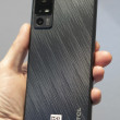
Because of its stubby design, the Motorola Charm seems a bit square at first glance, though it's actually much taller than it is wide. The phone has a solid, classy feel to it all around. There's a metallic band that stretches around the edge. Around back, the battery cover has a fantastic soft touch finish that makes it very pleasant to hold. That cover required some tough prying to pull it loose, but it was easy to replace. Under the cover you'll find the microSD port, but it isn't blocked by the battery so you can change cards while the phone is powered on.
The phone may seem a bit wide in the hand, but it's still easy to hold and I had no trouble stretching my thumb from one side of the screen to the other. The Charm is small, but not especially slim. It might not be a great fit for a tight pair of jeans, but you'll be able to throw it into a clutch purse or regular pants pocket with no trouble.
The screen is a 2.8-inch QVGA in a landscape orientation, so it's wider than it is tall. That's hard for some Android apps to deal with, as I'll explain below. Just beneath the screen are three touch sensitive buttons: Menu, Home and Back. They are spaced too far apart, perhaps to balance the overall wide look of the device. The usual Android search button gets its own key on the keyboard, right next to the space bar. I use this often, so I would have liked to see Search take its place up top, with the touch keys.
Around back, you'll find a small touch pad that Motorola calls the Backtrack. The lamentable Motorola Backflip had the same feature. Basically, using the Backtrack, you can manipulate the action without blocking the screen with your fingers. I'll talk about the Backtrack more in the Touch section of this review. Next to the Backtrack you'll find the 3 megapixel camera. The camera button is part of the keyboard. I like the way this all works out. You don't have to flip the phone to use the camera button properly, and my fingers never got in the way of my snapshots. That's a frequent problem I have with other phones, but not the Charm.
On the left side of the phone you'll find a volume rocker, nicely raised from the metal band surrounding it. On top, a screen lock / power key is a bit more shallow, but it was still easy to find. All of the other shortcuts and buttons are part of the QWERTY keyboard on the phone's face.
The keyboard on the Motorola Charm is great. I prefer well-raised keys with plenty of springy action, and the Charm keyboard fits my preferences perfectly. The keyboard looks small and short at first glance, but each key is a large dome with a satisfying amount of travel and a sturdy click beneath. I often dread text fields when a keyboard is lousy, but on the Charm I found myself looking forward to typing.
The keyboard offers a full QWERTY with numbers assigned as Alt keys. There's an inverted-T arrow layout for fine-tuned text editing. The camera button is there, as I mentioned, and next to it a messaging key that jumps to the universal inbox. I'd like to customize this button so that it takes me to a new, blank text message instead, but the phone doesn't let you change the function.


 iPhone 14 Plus Offers a Big Screen For Less
 HMD Launches Barbie Phone in US
 iOS 16 Revamps the Lock Screen
 Apple Watch Goes Ultra
 Google Overhauls Android's Parental Controls
 Motorola Charm


