Nokia World 2010
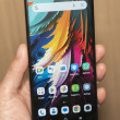
The Nokia C7 is not an inspiring design, like the Nokia N8, but it is attractive and sleek. It's more reminiscent of the Google Nexus One, with its curved edges and stylish tablet-like design. I was happy to see that Nokia left the Send and End keys beneath the screen. The Nokia E7 forgoes these buttons in favor of onscreen replacements, but I'd rather have the satisfaction of pressing real keys. The phone has a lot of metal around the shell, but its a far cry from the unibody aluminum design of the Nokia N8. This isn't a phone that you'll be showing off much, at least not for its attractive looks, but it's still a modern-looking device.
Compared to the Nokia N8, there isn't much that's been left out of the Nokia C7. The camera is lower-res, but few companies are packing 8 megapixel cameras on their high end smartphones, let alone their midrange kit. There's no HDMI output for high definition movie screenings, but there is at least a 3.5mm A/V port, and with a special cable you can plug the C7 directly into your TV and watch videos in standard def.
The AMOLED screen on the Nokia C7 is very nice. Overall, in my hands-on time, the phone seemed very responsive to the touch. Swiping gestures and gentle taps all registered on my first try. I still found the interface to be a bit sluggish, though. Holding down my finger on the main menu produced a long delay, with a spinning 'wait' icon, before the widget menu popped up. Quitting apps sometimes took just as long. These are still pre-production units, so hopefully the Symbian^3 interface will be steaming along by launch time.
Check out my hands-on look at the Nokia C7 below:


 Review: Nokia C7 Astound
 Nokia Brings C7 To T-Mobile As Astound
 Nokia Astound / C7-00

