Nokia World 2010
Though my PhoneScoop colleagues have had a chance to play with Symbian^3 on the Nokia N8, this was my first crack at the new smartphone OS. I went in with fairly low expectations. I didn't expect much of an improvement over Symbian S60 5th edition, which is now part of the dormant Symbian^1. Unfortunately, I was correct.
The basic design of the interface remains mostly unchanged, or not in any way you'd notice. Using a new Symbian^3 phone is like watching a high-def version of a TV show that was released before anyone had HDTVs. It looks a little bit better all around, but it's also clearly descended from something born in the early 90s. The icons, the text and fonts are strikingly similar, and they all look dated.
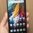
Even worse, the new stuff just doesn't look very new. While Android uses Widgets extensively, they are much more customizable. On Symbian, every widget looks the same, taking up the same space and shape on the homescreen. They hardly feel very widget-like, especially if you've used an Android phone. There are plenty of widget options, with more available for download, but in the end what you get is a very bland looking set of homescreen panels with straight columns and rows of widgets or empty space.
Past the widgets, I was shocked when I opened the main menu screen. The icon grid that Nokia uses would have been at home on an AT&T feature phone from 2004. It's barren and ugly, with no flash or dazzle. It straddles the line between Apple's bright and colorful icon grid and Microsoft's minimalist Metro UI for Windows Phone 7, borrowing the worst of both worlds.
But worse than the design is the interface's organization. You have to dig for everything. Nothing is intuitive on these phones. In my hands-on time, I was constantly asking Nokia reps for assistance. How do I close apps? How I find the dialpad? How do I see which apps are open? The design language does not explain the phone's function. Nokia needed to start with an entirely new and fresh design, but instead it seems like they just tried to improve the existing Symbian interface. They just put lipstick on that pig.
I did not spend much time with these phones, less than a half hour with each, and in his keynote address at Nokia World, Anssi Vanjoki took shots at journalists and bloggers who dismissed Symbian^3 after only seeing the phone's dashboard, without looking under the hood. I can say that after my testing period, I'm still unimpressed. The Nokia E7 was snappy and responsive, but I still saw a unit crash in a hands-on demo. As I moved down the line, the phones grew more and more weak. The Nokia C6-01 had noticeable wait times moving between menus and closing application. I can't remember the last time I waited for my smartphone to close an application, but C6-01 owners will be expected to hold still. So, I've taken a peak under the hood, perhaps the good stuff is under the floorboards?
The shakeup in Nokia's higher ranks might be encouraging on this front. Only yesterday, Vanjoki, who led Nokia's disparate smartphone teams, left the company. Also recently, Nokia's CEO was replaced by Stephen Elop, a Microsoft Executive with a successful record running the Microsoft Office team. Under Vanjoki, Nokia mostly excelled at hardware. Not so much with the recent Nseries phones, but the Eseries, like the E72 and E75, were very well designed, and the hardware on the new phones seems solid. With new leadership at the top with a successful record in software, perhaps Nokia can straighten out its interface problems.


 Review: Nokia C7 Astound
 Nokia Brings C7 To T-Mobile As Astound
 Nokia Astound / C7-00

