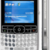
Review: Motorola Q
The home screen of the Q is packed with so much data by default that you actually have to scroll down to see it all. However there is no scroll bar, arrow or any other sign to indicate you can or should scroll down to see more. As on Windows Mobile Pocket PC, each module on the home screen displays different information and provides direct access to different applications. In addition to all the home screen modules, the left soft key provides access to the main menu (labeled Start, like on PCs) and the right opens the contacts list.
The main menu is a grid you scroll through for applications and settings panels. Only 6 icons are shown at a time, which could mean you'll be scrolling for a while. There are no keyboard shortcuts to launch any of the applications by their position on the grid. Once inside applications or sub menus, choices are displayed in a list, and each item on the list has a keyboard shortcut - a letter is displayed next to each entry.
The Q's menus are noticeably more responsive than the prototype we played with earlier, and are now on par with other Windows Mobile 5 Smartphones. There is still a noticeable delay when opening applications, but it is not unbearable. Menus and other performance is generally snappy once an application is open.
Since the power button is combined with the end key, there will be some initial confusion for experienced Microsoft smartphone users about keylock and the power button shortcuts. Since holding down the end key turns the phone on and off, that no longer acts as the keylock. In addition, since there is no unique power button, the shortcut menu normally accessed by quickly tapping the power key is now summoned by holding down on the home key for about three seconds.


 Motorola Q Video Tour
 The Q - Motorola's Super Thin Smartphone
 RAZR-like Motorola Smartphone Leaked
 Motorola Refreshes its 4G moto g stylus
 Motorola Q


