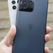
Review: HTC Vivid for AT&T
The Vivid runs Android 2.3 Gingerbread with Sense 3.0. There are no noticeable changes or differences between the menu layout of the Vivid and other Sense 3.0 phones.
Sense offers seven home screens, each of which can be populated with apps, shortcuts or widgets. HTC and AT&T have preloaded most of the screens, but these can all be completely customized. On the home screen, there are three software buttons at the bottom of the screen. One opens the main menu (this could be a bigger button, by the way), one takes you to the phone, and the third opens the “Personalize” panel. The Personalize panel lets you find and adjust all the phone's settings quickly right from the home screen. This includes HTC's Scenes, wallpaper, skins, sounds and alerts, etc.
The drop-down notification shade includes access to alerts as well as recently used applications. Rather than limiting the selection to the most recent four apps, you can slide the app listing sideways in the drop-down shade to get at the full list of open or recently opened apps. The inner menus don't appear to be altered.
The best feature of Sense 3.0 is still the lock screen, which we've noted in previous reviews. When the display is woken from sleep, there are four (customizable) app shortcuts at the bottom of the screen. Out of the box, they are the phone, email, camera, and text message apps. Pick the one you want and slide it down to a circle you'll see on the screen and the phone will go straight to that app. There's also a circle you can drag to unlock to the home screen.


 Hands-On: HTC Vivid for AT&T
 Fairphone 4 Comes to the US
 HTC Vivid


